Kristjan Eyjolfsson Brooch Visits the Chelsea Flower Show Once Again

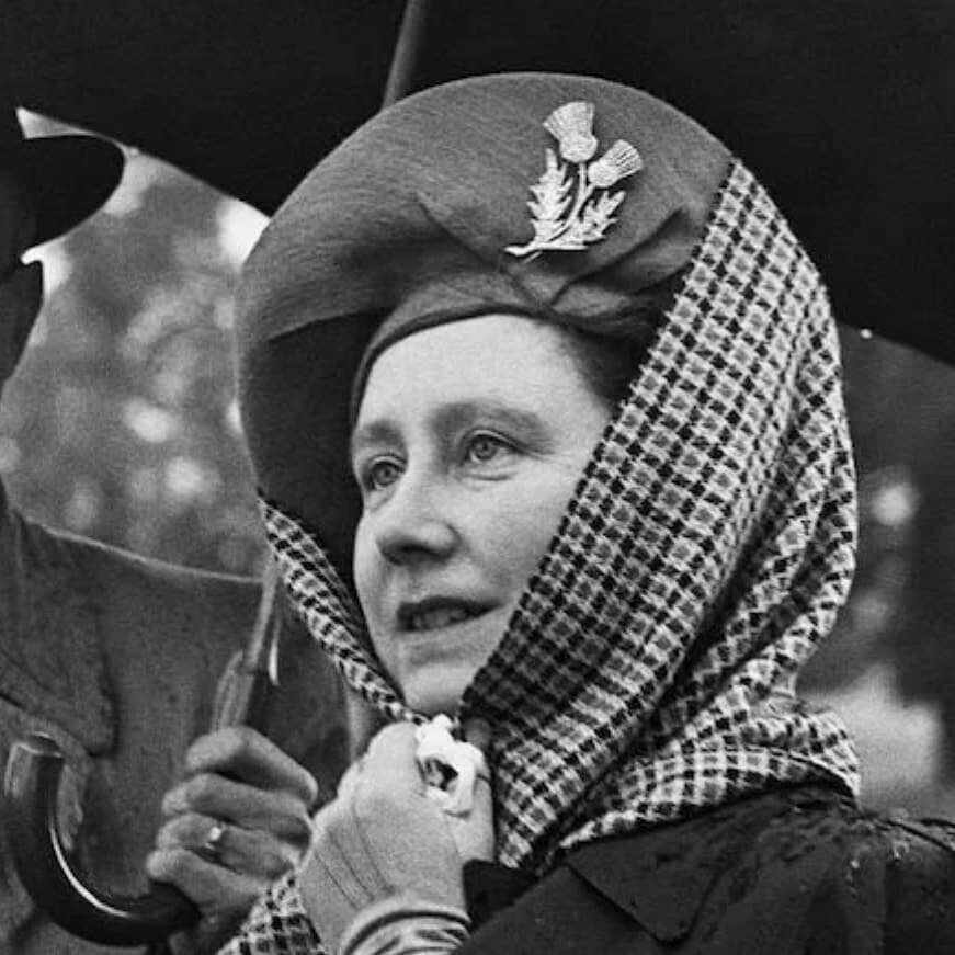
Her Majesty Queen Elizabeth II at the Annual Chelsea Flower Show 2017

Her Majesty Queen Elizabeth II at the Annual Chelsea Flower Show 2017

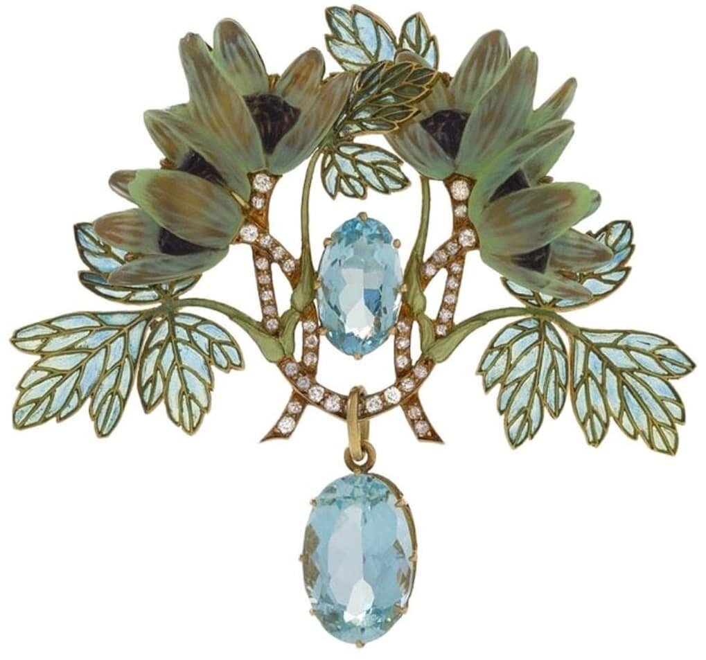
The brooch was inspired by the Iris Unguicularis, is made from 100% recycled British white gold and features over 100 ethically sourced gemstones, including a single conflict-free yellow diamond at its center.

The brooch was inspired by the Iris Unguicularis, is made from 100% recycled British white gold and features over 100 ethically sourced gemstones, including a single conflict-free yellow diamond at its center.

Queen Elizabeth II stepped out to take in the Chelsea flower show wearing an iris inspired brooch by Icelandic jeweler Kristjan Eyjolfsson that she first debuted during her 2013 private visit to the flower show. 

In 2013, for the show’s Centenary, Kristján designed and hand-crafted limited edition pins available to Chelsea Charity Gala Preview guests. The pins were inspired by the Calanthe x veitchii orchid flower, which was produced in the nursery belonging to Sir Harry Veitch, the nurseryman who first brought the Royal Horticultural Society Flower Show to Chelsea. All profits of their sale went to support the charitable work of the RHS.

The brooch worn by her majesty was inspired by the Iris Unguicularis. It was commissioned by the Royal Horticultural Society and presented to Her Majesty on the occasion of her Diamond Jubilee in 2012. The brooch is made from 100% recycled British white gold and features over 100 ethically-sourced gemstones, including a single conflict-free yellow diamond at it's center.

Eyjolfsson said of the brooch: "I am honoured to see Her Majesty wearing this brooch, which represents not only the RHS' gratitude for her patronage but also increased visibility of ethics and sustainability in fine jewellery. The brooch is not as glittery as some of her other pieces as it was designed to be a private piece to be enjoyed by a very famous monarch."

Visit the Royal Horticultural Society to read more about the flower show. 

Oscar Heyman: The Jewelers' Jeweler

There is a new book about Oscar Heyman coming out that I am super excited to get my hands on. It hits shelves on April 25th, but you can order yours now on Amazon!

For the past 95 years, Oscar Heyman & Bros. has sat ... at the helm of jewelry royalty. ―Antiques & Fine Art Magazine (2007)
Since its founding in 1912, Oscar Heyman & Brothers has created fabulous jewels for some of the world’s elite houses, causing it to be known in the trade as “the jewelers’ jeweler.” The Heyman Brothers arrived in New York from Eastern Europe in the early 1900s, bringing with them their training in their uncle’s workshop. The company quickly established a name for itself in the industry, working with top houses such as Cartier, Van Cleef & Arpels and Tiffany & Co., producing superbly constructed, beautifully designed pieces with the finest materials. The firm is still family run, and now retails merchandise under its own name, specializing in working with unique and colorful gemstones, cut and polished in their own workshop.
This lavishly illustrated history reveals “the jewelers’ jeweler” to the wider public, following the firm’s growth from its origin as a Russian immigrant family enterprise in New York City to its establishment as an important ally of major retailers throughout the global jewelry trade. Enhanced with dazzling photographs of new and vintage pieces, as well as brilliant, full-color design drawings from the firm’s archives that are works of art in their own right, Oscar Heyman: The Jewelers’ Jeweler reveals Oscar Heyman’s important role in the story of modern American jewelry.

Jewels Shine at the Royal Opera House in London

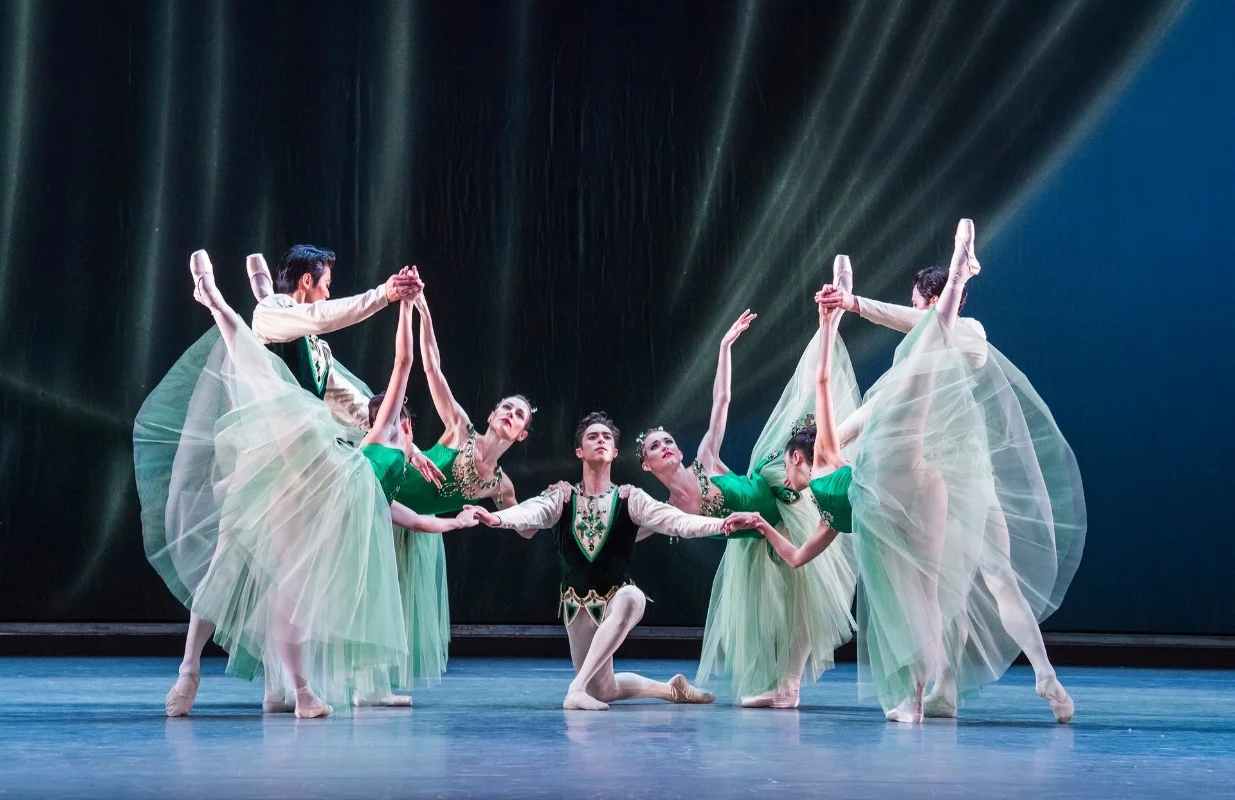
A scene from Emeralds. (Photo Credit: Tristram Kenton for the Guardian)

A scene from Emeralds. (Photo Credit: Tristram Kenton for the Guardian)

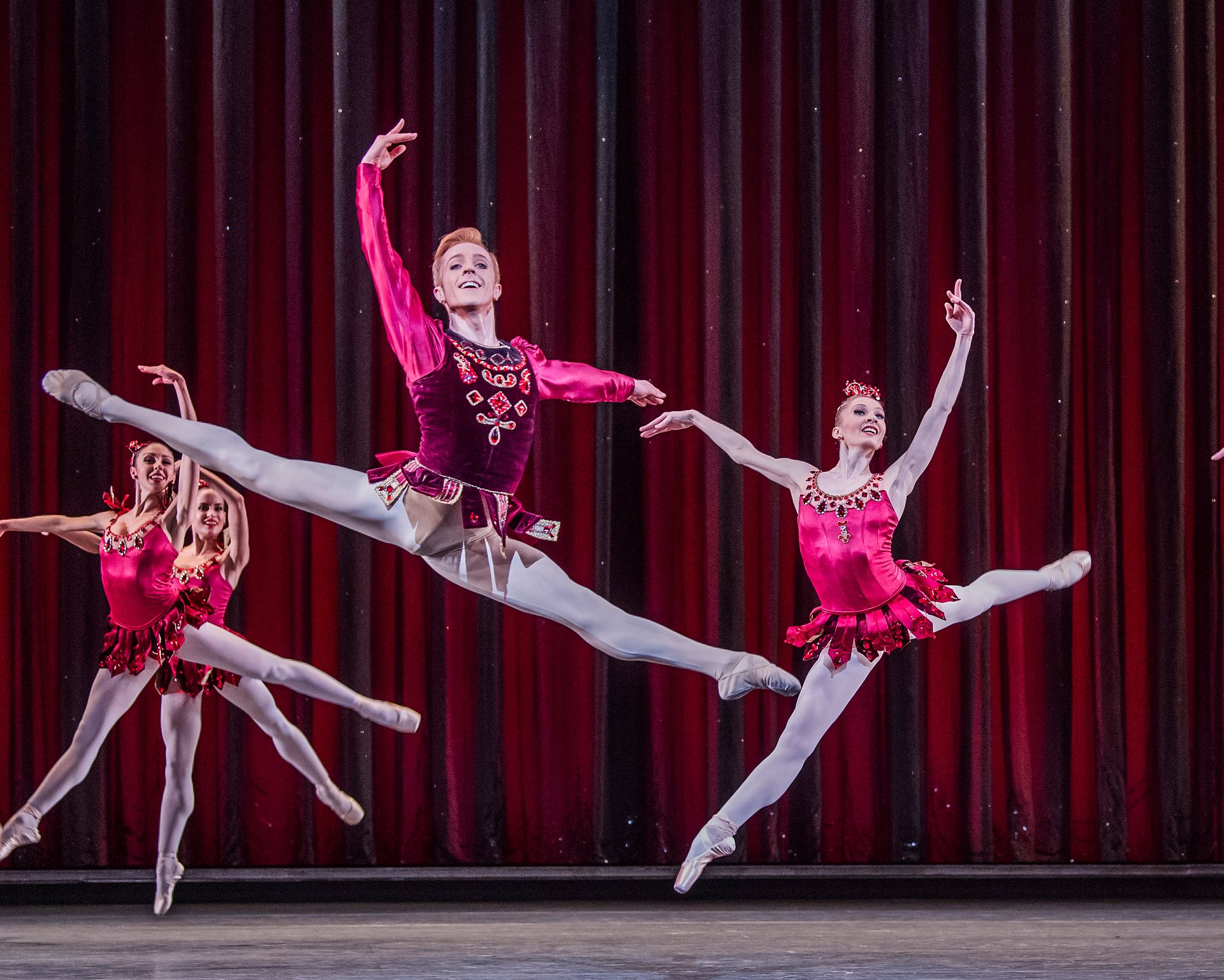
Steven McRae and Melissa Hamilton in Rubies. (Photo Credit: Tristram Kenton for the Guardian)

Steven McRae and Melissa Hamilton in Rubies. (Photo Credit: Tristram Kenton for the Guardian)

This year marks the 50th anniversary of  George Balanchine’s ballet, Jewels. Created in 1967, the ballet does not have any characters or plot, yet it’s one of the most enduring and popular pieces in many ballet company repertoires. 

Jewels uses three gem stones as starting points to explore an array of musical and dance styles, each intimately connected to Balanchine’s own life and career. 
 

"George Balanchine’s glittering ballet Jewels was inspired by the beauty of the gem stones he saw in the New York store of jewellers Van Cleef & Arpels. He went on to make history with this, the first abstract three-act ballet, first performed in 1967 by New York City Ballet. Jewels was performed in full by The Royal Ballet for the first time in 2007, using costume designs from the original NYCB production and new set designs by Jean-Marc Puissant.

Marianela Nuñez and Thiago Soares in ‘Diamonds’ (Photo Credit Bill Cooper)

Marianela Nuñez and Thiago Soares in ‘Diamonds’ (Photo Credit Bill Cooper)

Each of the three movements draws on a different stone for its inspiration and a different composer for its sound. The French Romantic music of Fauré provides the impetus for the lyricism of ‘Emeralds’. The fire of ‘Rubies’ comes from Stravinsky and the jazz-age energy of New York. Grandeur and elegance complete the ballet in ‘Diamonds’, with the splendour of Imperial Russia and Tchaikovsky’s opulent Third Symphony. Each section salutes a different era in classical ballet’s history as well as a distinct period in Balanchine’s own life. Through it all, Balanchine displays his genius for combining music with visionary choreography."


Jewels runs 6–21 April 2017 with a live cinema showing on the 11th. For ticket information please visit the Royal Opera House website. 

Find out more at http://www.roh.org.uk

To search for a cinema showing Jewels near you please visit the Royal Opera House website

Pantone Spring 2017

“Reminiscent of the hues that surround us in nature, our Spring 2017 Fashion Color Report evokes a spectrum of emotion and feeling. From the warmth of sunny days with PANTONE 13-0755 Primrose Yellow to the invigorating feeling of breathing fresh mountain air with PANTONE 18-0107 Kale and the desire to escape to pristine waters with PANTONE 14-4620 Island Paradise, designers applied color in playful, yet thoughtful and precise combinations to fully capture the promises, hope and transformation that we yearn for each Spring.” - Leatrice Eiseman, Executive Director of the Pantone Color Institute

Pantone12017

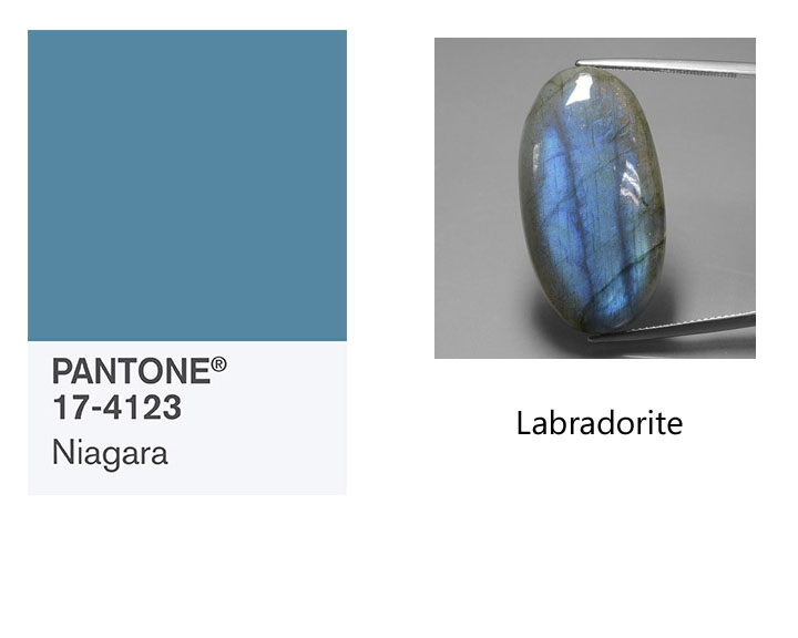
PANTONE 17-4123 Niagara
"Comfortable and dependable, Niagara leads the PANTONE Fashion Color Report as the most prevalent color for spring 2017. Niagara is a classic denim-like blue that speaks to our desire for ease and relaxation." 
Labradorite
Labradorite is a member of the plagioclase feldspar group. The stone was named after its place of discovery in Labrador, Canada. It has since been found in other places, including Finland, Norway, Madagascar, and Australia. The official term for the iridescent optical effect exhibited by labradorite, is "labradorescence". 

PANTONE 13-0755 Primrose Yellow
"By contrast, Primrose Yellow sparkles with heat and vitality. Inviting us into its instant warmth, this joyful yellow shade takes us to a destination marked by enthusiasm, good cheer and sunny days."
Yellow Apatite
This Golden Yellow Apatite originates from Madagascar. Apatite is a very common mineral however transparent gemstone-quality apatite is extremely rare and is not often found in jewelry stores. Apatite occurs in such a wide variety of attractive colors and forms, and has become a favorite among gemstone collectors. 

PANTONE 19-4045 Lapis Blue
"Conveying even more energy is Lapis Blue. Strong and confident, this intense blue shade is imbued with an inner radiance."
Lapis Lazuli
Lapis lazuli has been used as a gemstone for thousands of years. It has been mined from Afghanistan since the early 7th millennium BC. Lapis is technically defined as a rock rather than a mineral. It is primarily composed of lazurite with varying amounts of sodalite, calcite, pyrite and other various minor constituents. This variation causes the color variations in lapis. 

PANTONE 17-1462 Flame
"A red-based orange, Flame, is gregarious and fun loving. Flamboyant and vivacious, this wonderfully theatrical shade adds fiery heat to the spring 2017 palette."
Fire Opal
This Orange Fire Opal originates from Mexico. Fire opal is a gem-quality form of amorphous hydrated silicon dioxide with no crystalline structure. Like other opal, three to ten percent of the weight of fire opal is water. The name 'fire opal' is derived from its 'fiery' orange color, though it can also be white or brown. Fire opal that exhibits no play of color is sometimes referred to as jelly opal.

PANTONE 14-4620 Island Paradise
"Island Paradise is a refreshing aqua that calls to mind a change of scenery. A cool blue green shade that speaks to our dream of the great escape, Island Paradise is emblematic of tropical settings and our desire to unwind."
Aquamarine
This Light Blue Aquamarine originates from Mozambique. Aquamarine is a blue to green-blue variety of precious beryl. (The beryl group of minerals is most famous for green emerald.) Aquamarine is one of the official birthstones for those born in March. aquamarine can be light-blue, dark-blue, blue-green and green-blue. The more saturated the color, the higher the value, although almost all aquamarine is typically a lighter blue tone.

PANTONE 13-1404 Pale Dogwood
"Continuing the tranquil mood, Pale Dogwood is a quiet and peaceful pink shade that engenders an aura of innocence and purity. The unobtrusive Pale Dogwood is a subtle pink whose soft touch infuses a healthy glow."
Morganite
This Light Pink Morganite originates from Afghanistan. Morganite is the light pink to violet-pink variety of beryl. Morganite was first identified in Madagascar, in 1910. It's name was bestowed by George D. Kunz, a famous American gemologist and buyer for Tiffany & Company who named it in honor of John Pierpont (J.P.) Morgan, an American banker and avid gemstone collector.

PANTONE 15-0343 Greenery
"Bringing forth a refreshing take, Greenery is a tangy yellow-green that speaks to our need to explore, experiment and reinvent. Illustrative of flourishing foliage, the fertile attributes of Greenery signals one to take a deep breath, oxygenate and reinvigorate."
Peridot
This Green Peridot originates from China. Peridot is a gem-quality variety of the mineral olivine and you may see it referred to as "olivine" in older texts or in reference to vintage jewelry pieces. Peridot is one of the few gemstones that comes in a single color, green. The green may vary from yellow-green to olive to brownish green. The depth of the green color is dependent on the level of iron content in the stone's chemistry.

PANTONE 17-2034 Pink Yarrow
"Tropical and festive, Pink Yarrow is a whimsical, unignorable hue that tempts and tantalizes. Bold, attention getting and tempestuous, the lively Pink Yarrow is a captivating and stimulating color that lifts spirits and gets the adrenaline going."
Pink Tourmaline
This Pink Tourmaline originates from Mozambique. Tourmaline gemstones is found in all colors of the rainbow. The name tourmaline comes from the word toramalli, which means “mixed gems” in Sinhalese (a language of Sri Lanka). For more on tourmaline please click here.

PANTONE 18-0107 Kale
"Evocative of the great outdoors and a healthy lifestyle, Kale is another foliage-based green that conjures up our desire to connect to nature, similar to the more vivacious Greenery. And, just as we see in nature, this lush and fertile natural green shade provides the perfect complementary background to the more vibrant tones in the palette."
Serpentine
This Green Serpentine originates from Afghanistan. Serpentine's name is thought to be derived from its serpent-like green colors. The stone is usually green, yellowish-green, or brownish-green in color. 

PANTONE 14-1315 Hazelnut
"Rounding out the spring 2017 colors is Hazelnut, a key neutral for spring. This shade brings to mind a natural earthiness. Unpretentious and with an inherent warmth, Hazelnut is a transitional color that effortlessly connects the seasons."
Rutilated Quartz
This Rutile Quartz originates from India. Rutilated quartz is clear or smoky quartz with inclusions of rutile crystals. Rutile is the mineral name for natural crystals of titanium dioxide.


For more information on the color palette please visit https://www.pantone.com
For more information on the gemstones shown or to purchase them please visit http://www.gemselect.com

Web of Light

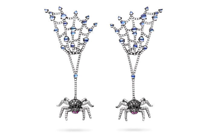
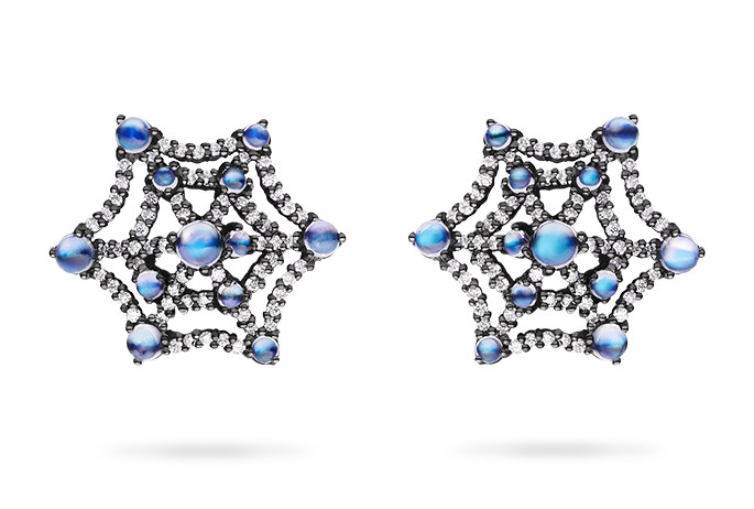
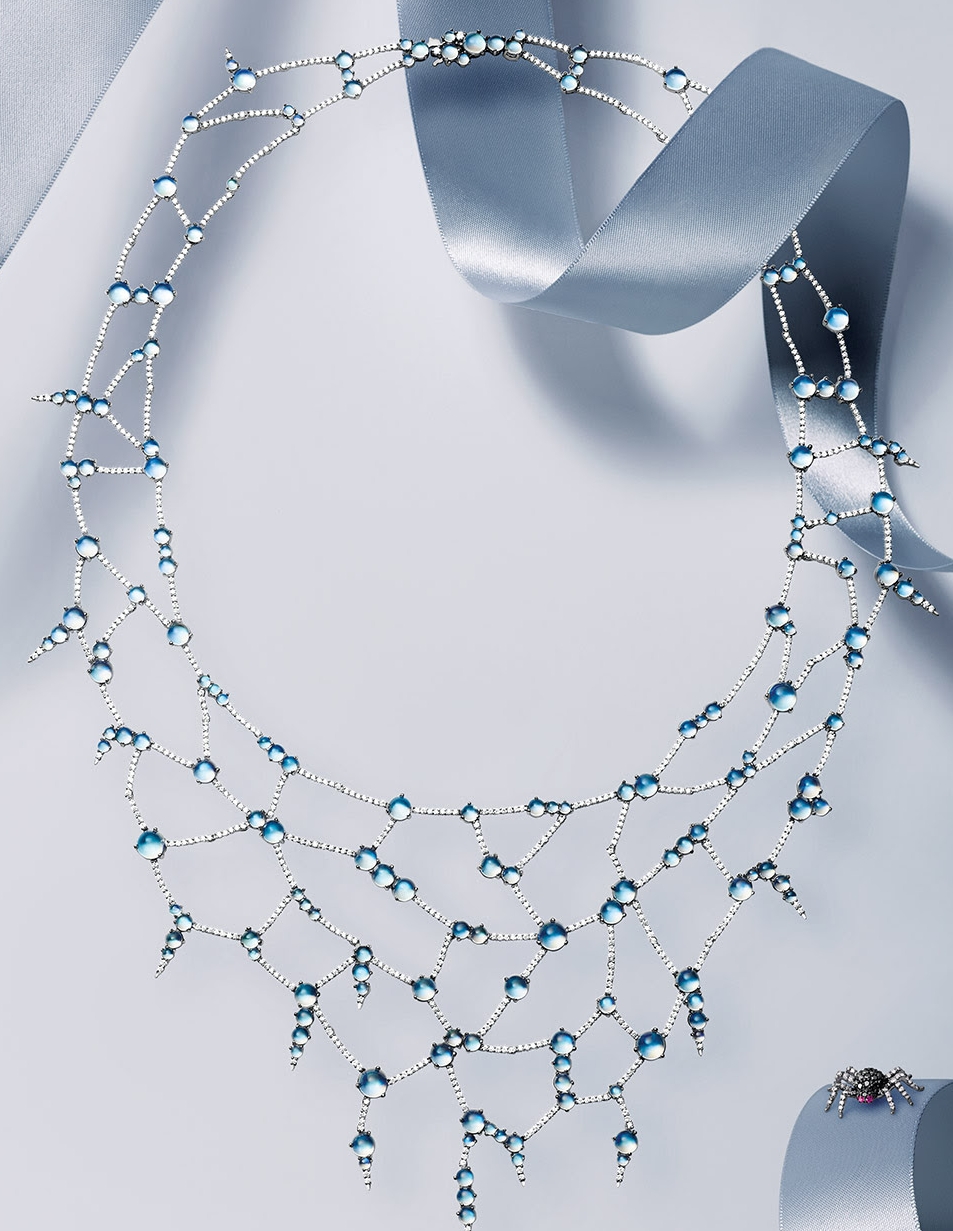
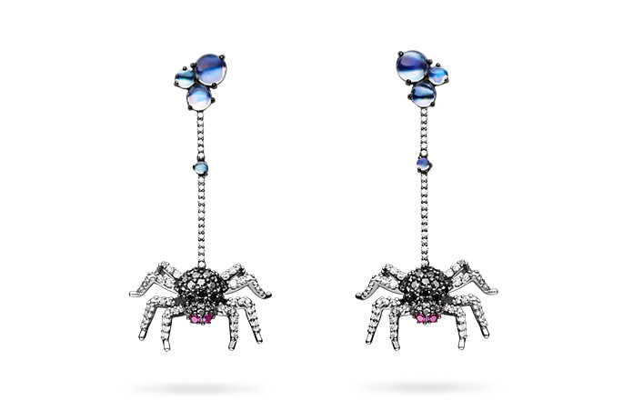
It is the perfect time of year for Paul Morelli to have release his gorgeous "Web of Light" jewelry. Like the webs created by the industrious spider Morelli's designs are intricate and delicate, with less creep factor and more wow factor. 

"When spider webs unite, each is an intricate strand in the web of life."


For more on Paul Morelli see my July Newsletter

Pantone's Fall 2016 Colors

banner

Pantone's Fall 2016 color campaign is entitled: A Unity of Strength, Confidence and Complexity. Leatrice Eiseman Executive Director of the Pantone Color Institute™ has this to say about the palette:

"The desire for tranquility, strength, and optimism have inspired a Fall 2016 color palette that is led by the Blue family.
Along with anchoring earth tones, exuberant pops of vibrant colors also appear throughout the collections. Transcending gender, these unexpectedly vivacious colors in our Fall 2016 palette act as playful but structured departures from your more typical fall shades.
Blue skies represent constancy as they are always above us. Grays give a feeling of stability, Red tones invite confidence and warmth, while the hot Pinkish Purples and Spicy Mustard Yellows suggest a touch of the exotic."

I am a big fan of this palette. I feel like the colors really embrace the variety of moods that embody the autumn season. Warm plays with cool and muted neutrals contrast against vibrant brights. I was once again inspired to put together a list of gemstones that I think are great representatives of this palette. So get into your cozy sweater, pour yourself a warm drink and enjoy.
(Click for the Spring 2016 Pantone Gemstone List

pantone stones
1

"Earmarking the importance of Blue in the palette, the new blue shade of PANTONE 17­-4028 Riverside undeniably takes precedence in the fall collections. Cool and calming, strong and stable [Riverside] displays a subtle vibrancy and sophistication. The color borders on exciting, yet maintains a sense of constancy"

When I saw this color I immediately thought of a bright sapphire that borders on cornflower blue.  For a slightly less expensive option I went with a nice denim colored Lapis Lazuli. 


"Pantone 14-4122 Airy Blue’s lofty nature evokes feelings of lightness and freedom. Designers seeking weightlessness in a world heavy with conflict." 

This beautiful soft color immediately called to mind blue topaz, however I also thought of a much less well known stone; Blue Larimar. Larimar is a trade name for the blue, gem-quality variety of a mineral called pectolite. Pectolite commonly occurs in gray tones and is not especially rare occurring in many locations around the world.
Blue Larimar is found only in one location in the entire world - the Dominican Republic. Blue Larimar is a hydrated sodium calcium silicate with manganese. Its blue color is due to calcium being replaced by copper impurities. Larimar is also often mixed with other materials such as calcite and hematite. Its color can vary from white to light-blue, and from medium sky to volcanic gray blue.


sharkskin

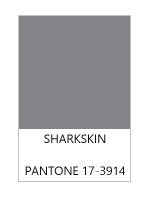
"There’s an edge to PANTONE 17-3914 Sharkskin, and yet it manages to remain neutral. [The color is] pair-able with almost any fall color, bright or muted [as it is a] color that the rest of the palette can rest on" 

If you read my article on Fall stones last year (read it here) you'll know that I am a huge fan of gray tones for fall. It's a moody color that can be either warm or cool. It can be worn on it's own as well as being a perfect neutral that plays well with virtually every other color. 

I wanted to give this fantastic neutral it's due so I have chosen three very different stones. The first is agate with swirling grays, creams, and charcoals. The second is cultured South Sea silver/grey pearl. The metallic look can add a bit of drama, and pearls come in many different sizes and qualities. The third option is a bit different. I chose a grey tourmaline because it has a beautiful watery look that can easily be used in either a dressed up or everyday jewelry piece. 


red

"In contrast to the stable backbone of the Fall 2016 palette, PANTONE 18-1550 Aurora Red adds a welcome punch. A bold Red that is warm, sensual and immediately pleasing to the eye [and] gets the metaphorical blood of the palette pumping. [The color is] exciting and dynamic, [and] breeds unmistakable confidence."

This red color really punches up the fall palette and made me think of maple tree leaves bursting into flames of color. Again I chose three gemstones that I think will add a little pizzazz.

The first is a red toned fire opal. This non-phenomenal version of opal often gives the appearance of having an internal glow, like the embers of a fire on a cold night. Red spinel has been gaining more attention in the recent years. In June of this year the stone was in the headlines when it was decided that it was to be August 's newest birthstone.  My third choice is Red Pyrope Garnet,  basically I see this stone as a slightly less expensive version of spinel. It has much of the same character and can be just as vibrant, but with less of a dent put in the pocketbook. 


taupe

"PANTONE 16-1318 Warm Taupe is a hearty, pleasing and approachable neutral that pairs well with each of the top 10 shades of the Fall 2016 season. [Warm Taupe] suggests reassurance and stability. [It is a color that is] trusted, organic and grounded]."

Taupe is one of those timeless colors. It will warm up a cool fall day. The first stone that I chose has a slightly more golden undertone. Moonstone is a soft looking stone that pairs well with cozy looks. Smoky quartz has a lovely warm tea like color, and with a relatively low price point you can easily go big with this gemstone. The slightly more unusual choice is fossilized coral. The lovely pattern is intriguing and adds interest without needing a lot of embellishment.


cedar

"Like Airy Blue, PANTONE 18-1630 Dusty Cedar gives a nod to the PANTONE Color of the Year 2016, Rose Quartz.
[Dusty Cedar is] a fall and winter version of the Pinks we’re used to seeing in spring. [It is a] dustier rose-toned Pink shade with some complexity [that] exudes warmth and welcome."

This dusty rose has a wonderfully old fashioned feel to is. I chose stones that maybe aren't as well known in the jewelry world. The first is a stone with a little bit of interesting controversy surrounding it. 

Andesine-Labradorite/Red Feldspar: "Andesine-labradorite" came onto the gem scene in 2003, so it is a relative newcomer. It is typically a reddish orange color, along with traces of green and yellow with a faint metallic luster known as labradorescence. The problem with andesine-labradorite is that it was originally sold without disclosing it's true origins and that it was color enhanced. The gemstone was presented as being from South America's Andes Mountains (hence the name 'andesine'). Later it was discovered that it was not actually a new mineral called 'andesine', but actually color-enhanced 'labradorite'. The name 'andesine' was very misleading. In an attempt to correct the problem, 'andesine' was later hyphenated to 'andesine-labradorite'. The trade name is widely used, but it is also referred to as just 'andesine', 'red labradorite', 'Congo sunstone', and 'red feldspar'.

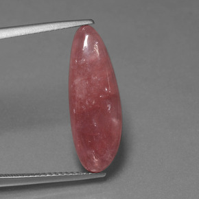
The second stone that I chose is not controversial, but it is also a relative newcomer. Rhodochrosite was first described in 1813, but wasn't introduced to the market until around 1940. It was named the state mineral of Colorado in 2002. Rhodochrostie is a softer stone and you will usually see it carved, made into beads, or cut into a cabochon.


green

"PANTONE 18-5845 Lush Meadow brings to mind fresh botanicals and foliage. [It is evocative of] rich and elegant, vibrant and sophisticated. This shade displays a brightness, panache and depth of color that elevates it from more natural greens [adding even more] elegance woven through this season’s collections."

My immediate thought when I saw this color was malachite. It's rich green tones are perfectly lush and full of life. Malachite is frequently cut into large stones and beads so don't be afraid to go big with a statement piece! The second stone that I chose is a classic green tourmaline. It is a stone that is easy to find and even a small tourmaline will create a pleasing pop of color. The reason that I chose tourmaline over emerald is essentially for the reason that is a more affordable stone in this color, though if price is no concern then emerald would also be a lovely representative!


mustard

"PANTONE 14-0952 Spicy Mustard is an exotic addition that bounces elegantly off other colors in the palette. [It] adds another splash of uplifting vibrancy; a spicier, zestier Yellow than previous seasons"

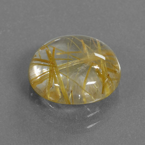
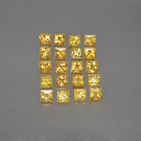
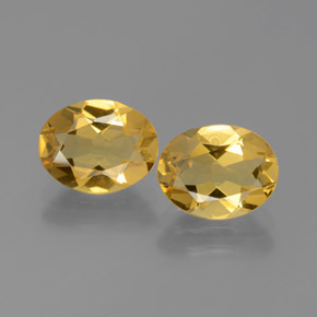
I am absolutely envious of anyone that can wear mustard colored clothing (a color that looks awful on me)! On the bright side you don't have to be able to wear mustard well to indulge in these spice inspired gemstones!  I've gone with an inviting golden beryl as my first choice. Second up is the more unusual rutilated quartz which contains beautiful (often golden) rutile needles. Rutilated quartz is one of the few gemstones desirable because of its inclusions! My third choice is a vibrant sapphire. The yellow-orange color will really stand out on a gray day. 


potters

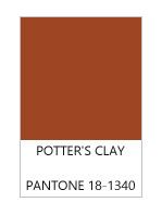
"PANTONE 18-1340 Potter’s Clay has an added degree of sophistication and layering. [It possesses] elements of russet. Orange in its undertones, gives a grounded feeling that’s anything but flat. [It is a] neutral earth tone; expected for fall and winter palette [possessing] real substance; a strong foundation."

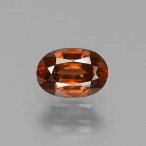
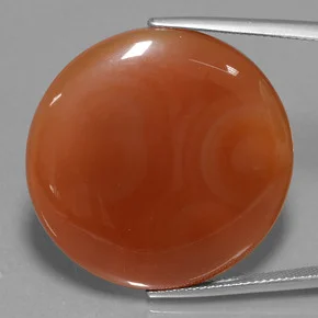
One of my favorite gemstones leads the charge in this color. Hessonite garnet is a wonderful choice to bring in the warm tone for fall. In fact this member of the grossularite garnet group has earned it the nickname cinnamon stone. Hessonite also has one of my favorite observable internal characteristics. When viewed under magnification the stone exhibits a "scotch-in-water" or "heat wave" effect cause by tiny included crystals crowded together to create a swirling effect. For those of you that are in the go big or go home category I would suggest carnelian agate. The stone still has the warm cinnamon tone but with less cost and larger sizes.  


10.jpg

"PANTONE 17-3240 Bodacious speaks to the gender fluidity we continue to see. [Bodacious] lends itself to vibrant color combinations [that are] unexpected in fall. [The color is] versatile; can be used with Pinks and Reds. [The] bright, rich Purple, with hints of a more sophisticated Pink."

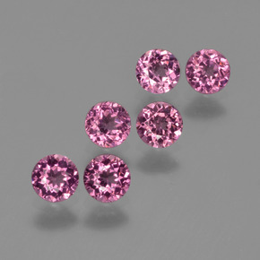
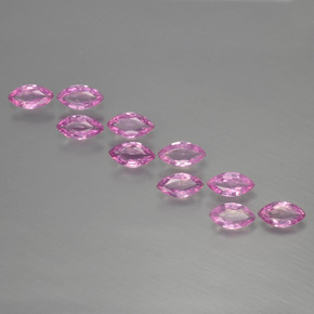
This bright fun color can bring a smile to your face and a bounce to your step! The first gemstone I chose is rhodolite garnet.  Rhodolite is a mix of pyrope and almandine garnet. It gets its name from the Greek word, "rhodon", meaning "rose colored". The second stone that I chose is cheerful bright pink sapphire. This flirty color will get you through the gloomy days for sure!

For more information on Pantone's Fall 2016 Palette please visit their website. Stone images courtesy of GemSelect

Happy Birthday Tiffany & Co.

tiffanylogo

On this day in 1837, Tiffany and Co. was founded by Charles Lewis Tiffany. In honor of this American jewelry icon I thought we would celebrate with a few beautiful pieces that are part of the MET museum's (Metropolitan Museum of Art) collection in New York. 

Tiffany & Co. (1837–present) ca. 1890. Made in New York, New York, United States. Gold, diamond, and enamel. Photo courtesy of the MET Museum.

"Related to the extraordinary enameled orchids displayed by Tiffany & Company at the 1889 Exposition Universelle in Paris, this flower pin with a textured gold stem and diamond-set leaves is enhanced by a single diamond dewdrop set amid the realistically rendered purple enamel petals. The gentle arc of its stem and the naturalistic blossom reflect the Art Nouveau style, which inspired jewelers toward the end of the century. The enameled orchids were designed by Paulding Farnham (1859–1927) and were exhibited at Tiffany's New York showroom prior to their departure for Paris. The New York Sun reported on March 17, 1889, that the jewels attracted more attention "than any flower show, display of orchids, or any other of nature's beauty ever brought together in this city."

Louis Comfort Tiffany (American, New York 1848–1933 New York). ca. 1904. Gold, silver, platinum, black opals, boulder opals, demantoid garnets, rubies, enamel. Photo courtesy of the MET Museum.


"After Charles Lewis Tiffany, founder of Tiffany & Company, died in 1902, his son Louis Tiffany was able to pursue artistic jewelry without reticence. He began working on this pursuit in 1902 to prepare himself for the St. Louis fair of 1904, where he exhibited twenty-seven pieces of jewelry. Tiffany Furnaces initially produced the jewelry, but after 1907 Tiffany & Company acquired Louis's artistic jewelry department. This hair ornament is one of the most extraordinary pieces of Tiffany's surviving jewelry, incorporating a remarkably realistic rendering of two dragonflies resting on two dandelion seedballs. Tiffany designed the hair ornament for Louisine W. Havemeyer, who, with her husband Henry Osborne Havemeyer were among Tiffany's most enlightened and devoted patrons. The hair ornament was known only from archival photographs in the collection of the Tiffany & Company Archives until Louisine's great-granddaughter brought it to the Museum's attention. The piece epitomizes his earliest jewelry designs, which were based directly on modest forms in nature, such as field flowers and wild fruit, as well as his affinity for enameling and semiprecious stones with unusual colors. The dragonflies rest on dandelion seedballs, one of which is shown partially blown away, underscoring the fragility of nature. Highly skilled artisans conveyed the transparency of the insects' wings through delicate metalwork filigree. The temporal quality is revealed in the subject: dragonflies rest in one place for mere seconds before flitting away; dandelions disperse into thousands of airborne seeds with the gentlest of breezes."

Louis Comfort Tiffany (American, New York 1848–1933 New York)
Date: ca. 1904. Opals, gold, enamel. Photo Courtesy of the MET Museum.

"This necklace, composed of grape clusters and leaves, is one of the earliest known examples of jewelry designed by Louis Comfort Tiffany. Tiny black opals represent the clusters of fruit, and finely executed enameling in shades of green on gold forms the delicate leaves. Opals appealed to Tiffany for their fiery glow, reminiscent of his vases in Favrile glass. The asymmetry of the design and its organic shapes are entirely in keeping with his passion for natural forms. This necklace was among the twenty-seven pieces that Tiffany made for the Louisiana Purchase Exposition in Saint Louis in 1904. It has been altered twice since its original conception, first by the addition of grape clusters on either side of the central pendant and later by the addition of a double bar-link chain. These changes were probably overseen by Tiffany himself, who is believed to have presented the necklace to his nurse and later companion, Sarah E. Hanley."

The MET Museum

Pearls and Pools: Olympic Swimmer Kathleen Baker

Olypmic silver medalist Kathleen Baker in her signature pearl earrings

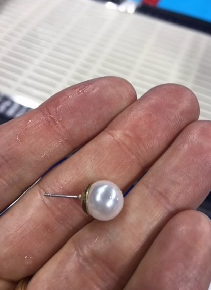
Lost earring found

Lost earring found

On Sunday, August 7th during the preliminaries for the 100m women’s backstroke, American swimmer (silver medalist) Kathleen Baker lost one of her signature pearl earrings to Rio’s Olympic pool, the depths of which reach almost ten feet. Thankfully, a diver went down to search for the earrings, and ultimately recovered it from Baker’s lane around the 15 meter mark. 

The story has a happy ending, but it does bring up a few cautions for anyone who wears their jewelry swimming or who may be thinking of adopting some good luck swimming pearls of their own.  

The most obvious thing to consider is that jewelry can and will fall off. Earrings, necklaces, bracelets, and rings all have ways of finding themselves falling to the bottom of pools, lakes, rivers, and oceans all over the world. If you're lucky you will find them again, but more often the pieces are gone for good. 

Now you may say "but I can lose my jewelry on dry land as well!" I would agree with you, but there is a less obvious but possibly even more serious concern when it comes to swimming in jewelry. 

pearl crosssection

Pearls
Both natural and cultured pearls are covered in a luminous substance called nacre. In natural pearls this layer has built up over an immense amount of time and is incredibly thick (hence their high cost and relative rarity), in the more common cultured pearl the nacre present on the surface of the seed material (see image). The nacre contains some organic proteins and also calcium carbonate. Calcium carbonate dissolves when it comes into contact with acid. Even mild acids (perfumes, lotions, hairspray, and makeup) can weaken the structure of the pearl’s nacre and eventually dissolve its beautiful shine. 

The chlorine used to purify water is actually sodium hypochlorite, the same stuff you find in household bleach. This particular type of chlorine is highly oxidizing, and has a tendency to destroy a pearl’s luster on contact. Over time the pearl's nacre will come off, leaving a cloudy surface; it may even peal off in layers while the inside continues to disintegrate (it's not pretty, trust me).

Precious Metals
So while all that is happening to your pearls, your metal is going through an equal amount of hardship. 
Chlorine can react with precious metals, including gold and silver. If you’re in the pool every day or cleaning with bleach products it can cause pits in the gold’s surface that look like little dents. Chlorine can actually break down gold jewelry to the point of disintegration. A gold ring, placed in undiluted bleach, can disintegrate within minutes of exposure. Stress corrosion cracking can also occur in any weak joints of the jewelry or areas where it has been repaired. In general, platinum doesn’t react with chlorinated pool water, but some platinum rings contain gold solder that can. 

But I have to wear it!
If you absolutely must wear jewelry in the pool then the best metallic material to wear is stainless steel, specifically type 316 stainless steel, which is resistant to chloride attacks from sweat and sea water. Titanium alloys also stand up well. If you are firmly on board the pearls-in-the-pool train then I suggest imitation pearls. There are various types of imitation pearls from plastic, to glass, or shell. The relative inexpensive nature of the imitations means your heart and your wallet wont break when an earring is lost or dissolved in the pool. 

No matter what your jewelry’s made of, one thing is certain: all of that sweat and chlorine will dull its brilliance, so make sure to clean it. Most colored gems can be cleaned in warm water with mild soap and a soft brush. Precious metals should be cleaned similarly. When in doubt about cleaning jewelry make sure you ask! Gemologists are here to help. 

Enjoy your gemstones and metals out of the pool. (Olympic Silver Medalist Kathleen Baker)

Enjoy your gemstones and metals out of the pool. (Olympic Silver Medalist Kathleen Baker)

FTC to Crack Down on Influencer Posts

The US Federal Trade Commission is cracking down on ‘deceptive endorsements’ by Internet influencers who have been paid by brands.

By Sarah Frier and Matthew Townsend; editor: Emily Biuso. Source

Snapchat star DJ Khaled raves about Ciroc vodka. Fashion lifestyle blogger Cara Loren Van Brocklin posts a selfie with PCA Skin sunscreen. Internet personality iJustine posts Instagrams from an Intel event. Missing from their messages: any indication about whether they have been paid.

This uptick in celebrities peddling brand messages on their personal accounts, light on explicit disclosure, has not gone unnoticed by the US government. The Federal Trade Commission is planning to get tougher: Users need to be clear when they are getting paid to promote something, and hashtags like #ad, #sp, #sponsored — common forms of identification — are not always enough. The agency will be putting the onus on the advertisers to make sure they comply, according to Michael Ostheimer, a deputy in the FTC’s Ad Practices Division. It is a move that could make the posts seem less authentic, reducing their impact.

“We’ve been interested in deceptive endorsements for decades and this is a new way in which they are appearing,” he said. “We believe consumers put stock in endorsements and we want to make sure they are not being deceived.”

This means more cases like the one against Warner Bros. Home Entertainment Inc., which last month settled with the FTC over charges that it deceived customers by paying internet influencers such as PewDiePie — who has about 50 million followers on YouTube — to promote the video game Middle-Earth: Shadow of Mordor with positive reviews, without disclosing that they were paid and told how to promote it. In March, the FTC issued a complaint against Lord & Taylor for paying fashion influencers to create posts about one of its dresses on Instagram, without disclosing that the retailer paid them and gave them the dresses for free. Any compensation, including free products, should be disclosed, the FTC says.

Companies have been pouring marketing dollars into social media endorsements, paying everyone from a Hollywood celebrity to a mom who regularly Instagrams her baby snuggling with a puppy. Reaching consumers, especially 20-somethings, is increasingly difficult because of television’s waning marketing power. Social media is where those dollars are headed with brands already spending more than $255 million on influencer marketing every month just on Instagram, according to Captiv8, a company that connects influencers with brands.

Personal endorsements are as old as advertising itself, and there has always been abuse. So when the FTC highlights influencer marketing as having a disclosure problem, it can come across as unfair, said Stefania Pomponi, the founder of Clever Girls Collective Inc., a marketing agency that works with brands including Disney and Ford.

“We're venturing into a little bit of ridiculous territory with the FTC saying these things because influencers really want to follow the rules,” Pomponi said. “They want to do a good job — they want to be seen as useful to brands and don't want to do anything that would jeopardise their relationships.”

It's up to the FTC to be more clear and consistent about their policies and enforcement, she said. A lot of influencers think they are following the rules, but in fact are falling short. More than 300,000 sponsored posts on Instagram in July used hashtags like #ad, #sponsored and #sp, up from about 120,000 a year earlier, according to Captiv8. Ostheimer said that’s usually fine — unless it goes unnoticed.

“If consumers don’t read the words, then there is no effective disclosure,” Ostheimer said. “If you have seven other hashtags at the end of a tweet and it’s mixed up with all these other things, it’s easy for consumers to skip over that. The real test is, did consumers read it and comprehend it?”

Hashtags like #sp and #spon may not be fully understood, especially if they are buried at the bottom of a post, he said. And any disclosure would be better at the beginning. When it comes to video, the FTC calls for disclosure to be said out loud or displayed on screen. It can get even more complicated on Snapchat, where there's not an obvious place to put a hashtag, and the videos are only a few seconds.

Some advertisers say influencer posts do not deserve such careful disclosure, because they are not the same thing as a traditional ad. Lauren Diamond Kushner, a partner at Kettle, a creative agency in New York, has worked on influencer campaigns with brands including Sunglass Hut. She said the Instagram stars and YouTubers often only work with the brands that they genuinely like and use.

“I don’t know if I even think of it as an ad,” Kushner said in an interview earlier this year. “They say, ‘I’ll do this piece and I’m going to do it my way.’ Whereas if I’m scrolling in my Facebook feed and I see a big thing from H&M or whatever, that is an ad.” She likened influencer content to product placement — a basketball team wearing jerseys by Nike, for example.

The FTC disagrees. A character on a sitcom drinking a Diet Pepsi is not giving their personal opinion about the soda, and the actor is playing a character. The agency says the basic test is: If a consumer knew an endorser was compensated in any way, would that alter the view of the endorsement? In the overwhelming majority of cases, the FTC says yes.

Nicola Foti, who makes comedy sketch videos and has about 388,000 followers on YouTube, said brand deals are how he makes the bulk of his income. But he said he will only do them “as long as it’s something that I like or something that supports a product I like.”

“My audience is usually pretty receptive to anything I talk about brandwise because they trust that I’m not just selling them something I don’t care about,” he said.

One way of disclosing: tagging a brand and thanking them. “NEW VIDEO! SEX TOY UNBOXING thanks to @adamandeve!" read a recent tweet by Foti. The tweet does not hint at a brand deal, but the video, which has 25,000 views, displays "sponsored" on the screen within the first 30 seconds.

Nick Cicero, the chief executive officer of influencer marketing agency Delmondo, said the FTC has already changed some practices in the industry by bringing recent lawsuits. “For a lot of years it was really really loose, and you could get away with a lot more,” he said. Now he is telling all of his clients to use the hashtag #ad.

The FTC has been getting the word out with online webinars and guides, speeches and engaging trade associations. “We’re not calling up each individual ad agency,” Ostheimer said. It will also continue to go after the advertisers with legal action. While it has not charged an influencer for deceptive advertising, it has not ruled that out.

“We hope by bringing these cases that we not only stop the marketer and influencer who didn’t have adequate disclosures previously, but also get the message out that other companies should have clear and conspicuous disclosures,” he said.

In many cases, influencers are just following orders. When asked about her contracts with Intel, Justine Ezarik, otherwise known as iJustine, said, “Whatever the brand and legal tell us to do, we do to comply.” In most cases these days she will use #ad, #sp or say that she's “working with” or "partnering with" a brand. She will write about a sponsorship in the description of YouTube videos if she does not have time to address it on camera. Khaled is paid to rep Ciroc, and his representatives could not be reached for comment. Van Brocklin did not respond to a request for comment.

“It definitely is getting confusing,” Ezarik wrote in an e-mail. “The hardest part is when you only have 140 characters or a few seconds of a snapchat, how do you make the most of it?”


Japanese Emperor Akihito Indicates He Is Ready to Abdicate

Japan's Emperor Akihito waves to well-wishers as he and family members appear on the balcony of the Imperial Palace during the emperor's 81st birthday in Tokyo, in this Dec. 23, 2014 photo. PHOTO: ASSOCIATED PRESS

Japan's Emperor Akihito waves to well-wishers as he and family members appear on the balcony of the Imperial Palace during the emperor's 81st birthday in Tokyo, in this Dec. 23, 2014 photo. PHOTO: ASSOCIATED PRESS

TOKYO—Japanese Emperor Akihito signaled a desire to abdicate because of age and ill health, potentially ushering in the most significant change to the imperial system in the postwar era.

“When the emperor has ill health and his condition becomes serious, I am concerned that, as we have seen in the past, society comes to a standstill and people’s lives are impacted in various ways,” the 82-year-old emperor said in a 10-minute video message broadcast Monday.

Prime Minister Shinzo Abe said he took the emperor’s words seriously. The government is expected to open discussions on changing the law governing the imperial household, which doesn’t have any provision for abdication.

“Considering his majesty’s age and the burdens of official duties, we need to give thought to his majesty’s worries and contemplate what we can do,” Mr. Abe said.

The emperor’s remarks amounted to a valedictory address, summing up his nearly 28-year reign and describing the imperial role that he hopes to pass on soon to his elder son, Crown Prince Naruhito, who is 56.

It was only the second time the emperor has released such a video message. The first was to offer condolences after the March 11, 2011, earthquake and tsunami that devastated northeastern Japan.

He described a life of constant motion, traveling to “remote places and islands” across the archipelago and striving to “stand by the people, listen to their voices and be close to them in their thoughts.”

It was a job he said he no longer felt confident about doing “when I consider that my fitness level is gradually declining.”

In 2003, he was treated for prostate cancer. In 2012, he had heart surgery.

“I am worried that it may become difficult for me to carry out my duties as the symbol of the state with my whole being as I have done until now,” he said.

Emperor Akihito didn’t directly use the word “abdication.” But he left little doubt that was what he wanted, saying that alternatives such as having a regent perform his duties were unsatisfactory. Story continues here: Source

With Emperor Akihito looking to pass the chrysanthemum throne on to the next generation, we may be treated with a rare glimpse into Japanese Imperial succession traditions. 

Happy Birthday Lucy

Incomparable comedian and actress Lucille Désirée Ball was born on this day in 1911. I think she is a wonderful example of when sentiment can make a piece of jewelry priceless. 
When Lucy married Desi they eloped to Greenwich, Connecticut.
Lucy wore a black wool suit and her wedding ring was a brass ring that was purchased from Woolworth’s because all the other stores were closed at the time. The brass ring was later replaced by a large cushion-cut diamond in a platinum setting (pictured). 
Lucy has this to say about that simple brass ring. 
“Desi later gave me a platinum ring, that little discolored brass ring rested among the diamonds and emeralds in my jewel case for years … After the short ceremony, we ate our wedding breakfast in front of a bright fire in the club’s lounge. Outside, a fresh mantle of snow hung on the pine trees. After all the indecision we’d been through, Desi and I were dazed with happiness.” [Source: Lucille Ball. Love, Lucy. 1996. pg. 110]

Solid Gold Godzilla Hits the Market

GoldGodzilla

To mark the 60th anniversary of Godzilla and the new Hollywood film, Tokyo jeweller Ginza Tanaka is offering this solid gold Godzilla.

The website Fashion Press is reporting that the nearly ten inche tall 33 pounds statue is being sold by Ginza Tanaka for 150 million yen (US$1.47 million). 

The gold movie icon will be on display this month and next month in Tokyo and Osaka.

Source: Fashion Press News

Bastille Day

A piece of post revolution French history since it is Bastille Day.
The pear-shaped diamond and blue sapphire “toi et moi” engagement ring that Napoleon Bonaparte presented to his first wife, Josephine, whom he married in 1796. The piece sold at an auction in France in 2013 for nearly a million dollars. 
Napoleon and Josephine divorced after 14 years due to Josephine’s inability to produce an heir, however Josephine saved the ring, and it was passed on to future generations.

Queen Elizabeth II's Birthday Jewelry

June 10, 2016

Queen Elizabeth’s official 90th birthday celebration weekend started today and the royal lady herself wore a sunny primrose yellow Angela Kelly outfit paired with the stunning Richmond Brooch, which belonged to her grandmother, Queen Mary.
The Richmond brooch (by Hunt and Roskell) was a present from the town of Richmond on the occasion of Queen Mary’s 1893 wedding to the future King George V. The large brooch features diamonds set in a silver and gold scrolling design with a central pearl, with a pearl and diamond pendant. The pearl and diamond pendant is detachable making the brooch very versatile. Other pendants could be added, the brooch itself could also be used as a pendant or even as a hair decoration. Queen Elizabeth inherited the brooch when Queen Mary died, in 1953. 

June 11, 2016

How do you stand out among a sea of red? In neon green of course! Queen Elizabeth is quite fetching in her vibrant Stewart Parvin coat and Rachel Trevor-Morgan hat. 

The Queen also wore a brooch known as the Brigade of Guards Brooch or the Guards’ Badge. The badge combines the symbols of the Grenadier Guards, the Coldstream Guards, the Welsh Guards, the Irish Guards, and the Scots Guards. It features diamonds topped by a crown and the symbols are surrounded by an oval frame with the words QUINQUE JUNCTA IN UNO: “five joined as one”.

The brooch was originally created for the Queen’s grandmother Queen Mary. The brooch is worn annually at the “Trooping the Colour” (a parade to celebrate the sovereign’s birthday). Queen Elizabeth’s actual birthday is on April 21st, but she follows the tradition started in the 1900’s of celebrating it on a Saturday in June when the weather is fairer.

June 12, 2016

Queen Elizabeth’s brooch choice for today’s birthday festivities packs some historical punch. 
Queen Victoria’s Bow Brooch: 

Queen Elizabeth II at her 90th birthday celebration, one of Queen Victoria’s bow brooches, Queen Alexander with bows down her skirt, Queen Mary with bows as a makeshift stomacher, The Queen Mother with a single bow

The brooch is part of a set of three brooches (two large brooches and a slightly smaller brooch) that were commissioned by Queen Victoria from Garrard. They are constructed from 506 diamonds that she provided. These bows are among the jewels that Victoria willed to the crown for future royal use; they’ve passed from queen to queen. 

Queen Alexandra and Queen Mary can be seen wearing the set in photographs. They were known to also hang other jewels from the brooches adding to the sparkle. Queen Elizabeth (the future Queen Mother) wore them singularly in a modest fashion that was in keeping with the times. 

Today Queen Elizabeth follows her mothers example and wears just one at a time in a normal lapel brooch position.

Trapiche Emerald Ring: Reverend Chauncy Hare Townshend

I was haunting the archives of the V&A and came across this beautiful little trapiche emerald and gold ring. 
This ring is from the 1800’s and was bequeathed to the V&A by the Reverend Chauncy Hare Townshend, a cleric and poet. 
Chauncy Hare Townsend was born on 20 April 1798, and changed the spelling of his surname to Townshend in1828. He was educated at Eton and Trinity Hall, Cambridge, and published his first collection of poetry in 1821. In 1840, at the house of the mesmerist Dr John Elliston, he befriended Charles Dickens, who later served as his literary executor. At the time of his death, Townshend owned the manuscript of Great Expectations. 
On account of his poor constitution, Townsend lived abroad for long periods of time. He died in London on 25 February 1868. Townshend left his library to the Wisbech and Fenland Museum; his bequest to the South Kensington Museum comprised 186 oil paintings and 177 watercolour drawings, 832 volumes, 390 drawings, 1,815 prints, and gems, precious stones, cameos and intaglios. I love a piece with a good history don’t you? 

*The name trapiche comes from trapiche (de azúcar), “of sugar.” Trapiche emeralds have a spoke like structure that approximates the look of the grinding wheel used to process sugarcane in the region of Colombia, South America where they are most often found.*

Announcement: Youtube

Hi everyone! 
I some exciting news. I have started a YouTube channel. I already have a video review of a really exciting photo product up and ready for you to check out!

You can also read more about the triple d photo kit by clicking here

Pantone's Spring 2016 Colors

panquote

After a long and dismal winter it is exciting to see signs of Spring and one of those signs is the return of color. 
In their release statement Panatone says that their Spring color palatte, "Spring 2016: A Transporting and Transformative Canvas", contains  colors that "transcend cultural and gender norms. Vivid brights give way to excitement and optimism, though quiet stability prevails in this season’s palette. For Spring 2016 there are truly no perceivable distinctions in color choices between the men’s and women’s collections, both of which focus on a desire to breathe and reflect, then play."  

When I see color my mind immediately turns to gemstones (hazard of the job), so today I wanted to interpret the amazing mix of uncommon neutrals and vivid brights into gemstones. Some are obvious and some are not so. I had fun playing with color and I hope you do too!

ROSE QUARTZ: "Rose Quartz, a persuasive yet gentle tone that conveys compassion and a sense of composure. Like a serene sunset, flushed cheek or budding flower, Rose Quartz reminds us to reflect on our surroundings during the busy but lighthearted spring and summer months."
For this color the most obvious choice was the best choice. Rose or pink quartz is just what the name says, a pink variety of quartz. The muted pinks are a perfect way to usher in Spring. 

rosequartzpantone

PEACH ECHO and MALAY GARNET: "The fashion and design communities, and consequently, consumers, have been in love with orange for several seasons. Coming to the fore this Spring is, Peach Echo, a shade that emanates friendlier qualities, evoking warmth and accessibility. It is an all-encompassing, tempered companion in the playful orange family."
Malaya (malaia) garnet is one of the rarer and more interesting 'hybrid' varieties of garnet. It is primarily a mix of pyrope and spessartine, which was first discovered in the 1960s. The term "malaya" was derived from a Swahili word meaning 'outcast'. Miners gave it this name because when it was first discovered, local dealers wouldn't buy it, simply because it didn't fall into any of the standard garnet categories and it was cast aside! This is an absolute shame because the pinkish-orange colors of the stone are simply stunning. 

peachecho

SERENITY and SAPPHIRE: "Weightless and airy, like the expanse of the blue sky above us, Serenity comforts with a calming effect, bringing a feeling of respite even in turbulent times. A transcendent blue, Serenity provides us with a naturally connected sense of space."
Considered one of "the big 4" in the gemstone world, sapphires are available in every color of the rainbow excluding red (red is ruby). The perfect compliment to Serenity is a cornflower blue sapphire. It exudes calm but also provides a nice pop of color. 

SNORKEL and LAPIS LAZULI: "A maritime-inspired blue, Snorkel Blue plays in the navy family, but with a happier, more energetic context. The name alone implies a relaxing vacation and encourages escape. It is striking yet still, with lots of activity bursting from its undertones."
Lapis Lazuli (often called just 'lapis'), has been used as a gemstone for thousands of years. It has been mined from Afghanistan since the early 7th millennium BC. It was discovered in ancient burial sites throughout the Caucasus, the Mehrgarh and even as far as the Republic of Mauritania. The funeral mask for the ancient Egyptian pharaoh 'King Tut' was also decorated with lapis lazuli! 

snorkel

BUTTERCUP and LEMON QUARTZ: "With Buttercup designers reveal a shining beacon transporting its wearer to a happier, sunnier place."
Quartz is once again a great choice to bring the bright yellow color into your wardrobe, and because it is slightly less expensive it is a great way to bring large statement pieces in without breaking the bank. 

LIMPET and ZIRCON: "A shade of aqua that leans toward the green family, Limpet Shell is clear, clean and defined. Suggestive of clarity and freshness, its crisp and modern influences evoke a deliberate, mindful tranquility."
Zircon occurs in a wide range of colors, but the beautiful aqua blue is a perfect match! To read more about this amazing stone click here.

limpet

LILAC GRAY and SPINEL: "As in most any season, the need for neutrals arises. Essentially a basic, the subtlety of the lilac undertone in, Lilac Gray, adds a distinctive edge to this classic gray shade."
Gray can easily be kind of a downer color if you let it, but grey tones gemstones are anything but boring. Spinel is a hard vitreous magnesium aluminium oxide that has been used as a gemstone for centuries. The beauty of spinel has even caused it to be mistaken for ruby and sapphire in the past. The lilac color is a beautiful way to accent this interesting neutral from Pantone. 

FIESTA and SPESSARTINE GARNET: "The high energy Fiesta is a harbinger of excitement, encouraging free-spirited exploration to unknown but welcoming locales. A strong and fiery, yellow-based red, the vivid Fiesta provides a stark contrast to the calming, softer nature of this season’s palette."
Spessartine garnet in a redish hue provides the perfect punch to match this vivid color from Pantone. The name "spessartine" comes from the Bavarian word, "Spessartine", meaning "forest", which is a mountain range in Germany where spessartine garnet deposits were found in the 1880s. Spessartine was not often seen in jewelry until deposits were discovered and mined Namibia and Mozambique in the 1990s.

ICED COFFEE and SMOKY QUARTZ: "A transitional color that will take us through the seasons, Iced Coffee manifests as another strong neutral for the season. With its natural earthy quality, the softness and subtlety of Iced Coffee creates a stable foundation when combined with the rest of this season’s palette."
There are a surprisingly large number of "brown" gemstones (I happen to be a huge fan of brown stones). I chose Smoky Quartz because I wanted to (again) choose something that is relatively less expensive because having the option to create large statement pieces is always nice. 

GREEN FLASH and TSAVORITE GARNET: "Green Flash calls on its wearer to explore, push the envelope and escape the mundane, radiating an openness that combines with the rest of the palette in unexpected but serendipitous ways. The popularity of this brilliant hue is representative of nature’s persistent influence even in urban environments, a trend continuing to inspire designers."
Tsavorite is one of the most impressive members of the Garnet family. Tsavorite/lite was named in honour of the Tsavo National Park and the Tsavo River which flows through it. The name was proposed by the former president of Tiffany & Co., Henry Platt, who had followed the developments of the gemstone from the very beginning. A beautiful and lush color for Spring!

Jewelry that Speaks Volumes: Madeleine Albright

Today is International Women's day so it seems fitting to talk about a woman who shattered a huge glass ceiling and whose brilliant diplomacy extended beyond just her words: former U.S. Secretary of State Madeleine Albright.

Albright became the highest ranking woman U.S. history when she was appointed to the position of U.S. Secretary of State in 1997 by President Bill Clinton. Before that becoming secretary of state, Albright was the U.S. Ambassador to the United Nations. Albright was not only the first female Secretary of State, but also the first top diplomat to turn jewelry into a communication tool. 

Pins are not discussed in any diplomatic handbook, but Albright's quick wit and sense of humor made her jewelry into a useful diplomatic tool.  It was during her time as ambassador that Albright began to use her jewelry, specifically her brooches, as a means of sending non-verbal pointed messages and opening lines of communication with world leaders. “It would never have happened if not for Saddam Hussein,” she wrote in her book, Read My Pins: Stories From a Diplomat’s Jewel Box.  Albright recalls that it all began in 1993, just after the Gulf War: 

"It all began when I was at the United Nations. It was right after the Gulf War and the United States was pressing for resolutions sanctioning Iraq. During that time I had something dreadful to say about Saddam Hussein on a daily basis, which he deserved because he had invaded Kuwait. The government-controlled Iraqi media then compared me to an “unparalleled serpent.” I happened to have a snake pin, and wore it to my next meeting on Iraq. When the press asked me about it, I thought, “Well, this is fun.” I was the only woman on the Security Council, and I decided to get some more costume jewelry."

Serpent Pin, circa 1860. An eighteen-carat gold snake coiled around a branch, with a diamond dangling from its mouth.

A second brooch reinforced her approach. This brooch was a blue bird. Until the twenty-fourth of February 1996, she wore the pin with the bird's head soaring upward. On the afternoon of that day, Cuban fighter pilots shot down two unarmed civilian aircraft over international waters between Cuba and Florida. Three American citizens and one legal resident were killed. At a press conference, Albright denounced both the crime and the perpetrators, "I was especially angered by the macho celebration at the time of the killings. "This is not cojones," I said, "it is cowardice."" To illustrate her feelings, she wore the bird pin with its head pointing down, in mourning. Her comment departed from the niceties of normal diplomatic discourse, and caused an uproar. Albright held her ground. She says of the incident that, "As a rule, I prefer polite talk, but there are moments when only plain speaking will do."

Albright's brooches were often her way of "plain speaking" without saying a word, and over time reporters, staffers and world leaders learned to read her pins. "As it turned out, there were just a lot of occasions to either commemorate a particular event or to signal how I felt," she says. On good days, she wore flowers, butterflies, and balloons, and on bad days, all kinds of bugs and carnivorous animals. Jewelry became part of her personal diplomatic arsenal and everyone had taken notice.  

"I had an arrow pin that looked like a missile, and when we were negotiating the Anti-Ballistic Missile Treaty with the Russians, the Russian foreign minister asked, “Is that one of your missile interceptors you’re wearing?” And I responded, “Yes. We make them very small. Let’s negotiate.” Or, after we found that the Russians had planted a listening device—a “bug”—into a conference room near my office in the State Department, the next time I saw the Russians, I wore this huge bug. They got the message." 
Blue Bird, circa 1880. Anton Lachmann, Austria. Photo by JohnBigelow Taylor.Albright wore this blue-bird pin when, in 1996, airplanes carrying four Cuban-Americanfliers were shot down off the coast of Florida. 

Interceptor missile. 1998. Lisa Vershbow. USA.Albright wore this Interceptor missile pin when she visited the Russian president,Vladimir Putin.

Albright has said that she loved expressing herself with her jewels, and that making fashion statements — and commenting on each other's attire — is not completely unheard of within a diplomatic setting:

"You think that the heads of state only have serious conversations, [but] they actually often begin really with the weather or, 'I really like your tie.' "

That being said I think I can safely say that the former Secretary of State's brooches are far more intriguing than conversations about the weather, because behind every brooch are a thousand plainly spoken words.

This peace dove, ca. 1997, by Cécile et Jeanne of France, was a gift from Leah Rabin, widow of
Israeli Prime Minister Yitzhak Rabin. Among Albright’s favorites, the pin symbolizes the goal—peace in the Holy Land—“for which the prime minister had given his life,” she wrote.

Bee, Designer Unknown, USA. c. 1980.  Photo by John Bigelow Taylor.For a meeting with Yasser Arafat, Albright wore this bee pin. She writes, "I spent manyhours wrangling with the Palestinian leader about the need for compromise in the MiddleEast. My pin reflected my mood." (He sent her a butterfly.) 

"Because I am by nature a worried optimist (as opposed to a contented pessimist), I found many opportunities to wear my brooch of a brilliantly shining sun,” Albright wrote. This “Sunburst,” of gilded brass, was made in 1987 by Hervé van der Straeten of France.

“I was proud to be the first woman to serve as secretary of state. ... This is a pin showing the glass ceiling in its ideal condition: shattered.” The pin, called “Breaking the Glass Ceiling,” was made around 1997 by American artist Vivian Shimoyama, of dichroic and painted glass.

If you want to read more about Madeine Albright's pins and diplomacy I encourage you to buy her book. 

Iradj Moini Hear No Evil, Speak No Evil, See No Evil, 2000. "When I went to Russia with President Bill Clinton for a summit, I wore a pin with the hear-no-evil, see-no-evil, speak-no evil monkeys, because the Russians never would talk about what was really going on during their conflict with Chechnya. President Vladimir Putin asked why I was wearing those monkeys. I said, because of your Chechnya policy. He was not amused."


How do you wear a torc? From the British Museum

The Snettisham Great Torc. Found in Snettisham, UK. Electrum, 150 BC–50 BC. Diam. 19.9 cm. British Museum 1951,0402.2. (Photo: (c) The Trustees of the British Museum)

We've all seen these historical beauties, whether in museums or in articles, heavy gold torcs sometimes with elaborate designs. But have you ever wondered how you would wear such an item?
The British Museum recently addressed this issue in their blog.

How do you put on a torc?

Julia Farley, Curator, European Iron Age collection, British Museum; January 29, 2015

Although this is one of the most famous examples, the form is typical: open at the front, with a flexible neck-ring made of coiled or twisted wires. This type of torc is put on and taken off by being bent out of shape. You can see that one of the terminals of this torc has been pulled slightly forward compared to the other one. This is the result of it being repeatedly pulled open to be slipped on. A re-enactor friend of mine has told me that he often puts a torc on from the front, and then twists it round to bring the terminals to the front. I’ve tried with replicas, and I tend to slip mine on from the back, so there are different ways of doing it.

This constant flexing caused a lot of stress to the metal neck rings of the torc. When you bend metal in this way, it tends to harden and become brittle. You may have experienced this first hand if you have ever wanted to break off a piece of wire for hanging a picture or working in the garden and did this by bending it back and forth until it broke. The same thing happened to some torcs. We have many examples of truly beautiful neck-rings which were worn to destruction – taken on and off so many times that they broke at the back. They have often been somewhat clumsily repaired, as in this case:

(Photo: (c) The Trustees of the British Museum)


The break is covered with a thin sheet of gold foil, but X-radiography of the torc shows that all the wires have snapped! Torcs were quite fragile objects, and they were frequently broken and then repaired in this way. This is curious, because there was an easy way to avoid the problem. If you anneal the metal – heat it up to cherry-red temperature, around 600-700 degrees centigrade – it re-softens. This would have been a simple matter with the technology available. So why were so many torcs allowed to break? And why do the repairs often look like shoddy afterthoughts? I wonder if being the proud owner of a ‘vintage’ torc (old enough to be in need of flamboyant repairs) might have been something to be proud of. Rather than an unfortunate accident, breakage could have been part of the natural lifecycle of a torc. The repaired torc pictured above was buried in a hoard with many other, much newer, ones. By the time it went into the ground, it was probably an heirloom object, perhaps as much as 100 years old. It would have been possible to carry out much more subtle repairs, but perhaps they were supposed to be obvious? Being a member of a family with such a long history of wealth and power was probably a source of great pride, and the repairs might have emphasised the age of the object, and reminded people of the many stories attached to it.

On the Continent, there are other types of torc, which sometimes have clever hidden clasps, hinges, or removable sections such as these ones:

(Photo: (c) The Trustees of the British Museum)

When worn they would have given the impression of a solid ring of metal, but in fact they were relatively easy to put on and take off.

The idea of a hinge was taken up in later British neck-rings found in south-western Britain. They have a discreet hinge at the back, and a clasp at the front that was hidden when the terminals were closed.

(Photo: (c) The Trustees of the British Museum)

From these kinds of evidence, I strongly suspect that torcs were put on and taken off quite regularly, rather than being intended to be worn for very long periods of time. The most decorative were probably worn for special occasions, and some of the simpler designs may have been for everyday wear. But we have so little evidence for what constituted ‘day-to-day wear’ in the Iron Age that it’s hard to be sure.

But there are some torcs which I don’t think could be opened up, such as this one from Trichtingen in Germany, also in the Celts exhibition:

Torc. Silver, iron, 200–50 BC. Trichtingen, Germany. Diam. 29.5 cm. (Photo: P. Frankenstein/H. Zweitasch; (c) Landesmuseum Wurttemberg, Stuttgart 2015)

The gap isn’t wide enough to squeeze your head in, and there is a solid iron core under the silver, so it couldn’t have been bent. It also weighs nearly seven kilos! And if you did wear it, which way up would it go? It seems designed to be viewed upright, like in the picture. But with the terminals at the back the bulls would have been hidden, and with the terminals at the front their heads would be upside down, not to mention how uncomfortable those horns would be, sticking into your collar bone…

I think it’s most likely that torcs such as the one above weren’t worn at all. They might have been symbols of status to be brandished aloft, rather than worn around the neck, just like the way that the antlered god on this plaque from the Gundestrup cauldron hefts a torc into the air, terminals upright. However it was used, the torc was obviously a powerful symbol.

Cauldron. Silver, partially gilded, 100 BC–AD 1. Gundestrup, Denmark. Diam. 69 cm; H. 42 cm. (c) The National Museum of Denmark.

Cauldron. Silver, partially gilded, 100 BC–AD 1. Gundestrup, Denmark. Diam. 69 cm; H. 42 cm. (c) The National Museum of Denmark.

Read the entire article HERE
The museum's companion book (Celts: art and identity exhibition catalogue) is available for purchase as well HERE