Pantone Spring 2017
/“Reminiscent of the hues that surround us in nature, our Spring 2017 Fashion Color Report evokes a spectrum of emotion and feeling. From the warmth of sunny days with PANTONE 13-0755 Primrose Yellow to the invigorating feeling of breathing fresh mountain air with PANTONE 18-0107 Kale and the desire to escape to pristine waters with PANTONE 14-4620 Island Paradise, designers applied color in playful, yet thoughtful and precise combinations to fully capture the promises, hope and transformation that we yearn for each Spring.” - Leatrice Eiseman, Executive Director of the Pantone Color Institute
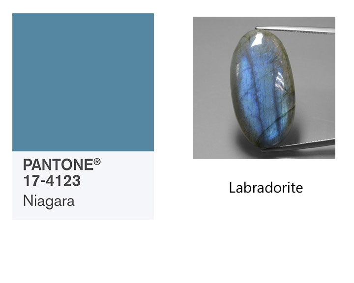
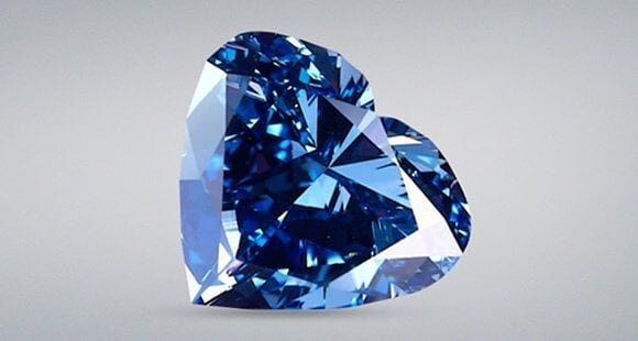
PANTONE 17-4123 Niagara
"Comfortable and dependable, Niagara leads the PANTONE Fashion Color Report as the most prevalent color for spring 2017. Niagara is a classic denim-like blue that speaks to our desire for ease and relaxation."
Labradorite
Labradorite is a member of the plagioclase feldspar group. The stone was named after its place of discovery in Labrador, Canada. It has since been found in other places, including Finland, Norway, Madagascar, and Australia. The official term for the iridescent optical effect exhibited by labradorite, is "labradorescence".
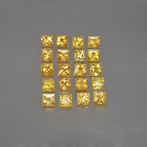
PANTONE 13-0755 Primrose Yellow
"By contrast, Primrose Yellow sparkles with heat and vitality. Inviting us into its instant warmth, this joyful yellow shade takes us to a destination marked by enthusiasm, good cheer and sunny days."
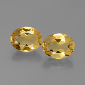
Yellow Apatite
This Golden Yellow Apatite originates from Madagascar. Apatite is a very common mineral however transparent gemstone-quality apatite is extremely rare and is not often found in jewelry stores. Apatite occurs in such a wide variety of attractive colors and forms, and has become a favorite among gemstone collectors.
PANTONE 19-4045 Lapis Blue
"Conveying even more energy is Lapis Blue. Strong and confident, this intense blue shade is imbued with an inner radiance."
Lapis Lazuli
Lapis lazuli has been used as a gemstone for thousands of years. It has been mined from Afghanistan since the early 7th millennium BC. Lapis is technically defined as a rock rather than a mineral. It is primarily composed of lazurite with varying amounts of sodalite, calcite, pyrite and other various minor constituents. This variation causes the color variations in lapis.
PANTONE 17-1462 Flame
"A red-based orange, Flame, is gregarious and fun loving. Flamboyant and vivacious, this wonderfully theatrical shade adds fiery heat to the spring 2017 palette."
Fire Opal
This Orange Fire Opal originates from Mexico. Fire opal is a gem-quality form of amorphous hydrated silicon dioxide with no crystalline structure. Like other opal, three to ten percent of the weight of fire opal is water. The name 'fire opal' is derived from its 'fiery' orange color, though it can also be white or brown. Fire opal that exhibits no play of color is sometimes referred to as jelly opal.
PANTONE 14-4620 Island Paradise
"Island Paradise is a refreshing aqua that calls to mind a change of scenery. A cool blue green shade that speaks to our dream of the great escape, Island Paradise is emblematic of tropical settings and our desire to unwind."
Aquamarine
This Light Blue Aquamarine originates from Mozambique. Aquamarine is a blue to green-blue variety of precious beryl. (The beryl group of minerals is most famous for green emerald.) Aquamarine is one of the official birthstones for those born in March. aquamarine can be light-blue, dark-blue, blue-green and green-blue. The more saturated the color, the higher the value, although almost all aquamarine is typically a lighter blue tone.
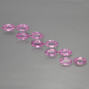
PANTONE 13-1404 Pale Dogwood
"Continuing the tranquil mood, Pale Dogwood is a quiet and peaceful pink shade that engenders an aura of innocence and purity. The unobtrusive Pale Dogwood is a subtle pink whose soft touch infuses a healthy glow."
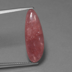
Morganite
This Light Pink Morganite originates from Afghanistan. Morganite is the light pink to violet-pink variety of beryl. Morganite was first identified in Madagascar, in 1910. It's name was bestowed by George D. Kunz, a famous American gemologist and buyer for Tiffany & Company who named it in honor of John Pierpont (J.P.) Morgan, an American banker and avid gemstone collector.
PANTONE 15-0343 Greenery
"Bringing forth a refreshing take, Greenery is a tangy yellow-green that speaks to our need to explore, experiment and reinvent. Illustrative of flourishing foliage, the fertile attributes of Greenery signals one to take a deep breath, oxygenate and reinvigorate."
Peridot
This Green Peridot originates from China. Peridot is a gem-quality variety of the mineral olivine and you may see it referred to as "olivine" in older texts or in reference to vintage jewelry pieces. Peridot is one of the few gemstones that comes in a single color, green. The green may vary from yellow-green to olive to brownish green. The depth of the green color is dependent on the level of iron content in the stone's chemistry.
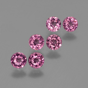
PANTONE 17-2034 Pink Yarrow
"Tropical and festive, Pink Yarrow is a whimsical, unignorable hue that tempts and tantalizes. Bold, attention getting and tempestuous, the lively Pink Yarrow is a captivating and stimulating color that lifts spirits and gets the adrenaline going."
Pink Tourmaline
This Pink Tourmaline originates from Mozambique. Tourmaline gemstones is found in all colors of the rainbow. The name tourmaline comes from the word toramalli, which means “mixed gems” in Sinhalese (a language of Sri Lanka). For more on tourmaline please click here.
PANTONE 18-0107 Kale
"Evocative of the great outdoors and a healthy lifestyle, Kale is another foliage-based green that conjures up our desire to connect to nature, similar to the more vivacious Greenery. And, just as we see in nature, this lush and fertile natural green shade provides the perfect complementary background to the more vibrant tones in the palette."
Serpentine
This Green Serpentine originates from Afghanistan. Serpentine's name is thought to be derived from its serpent-like green colors. The stone is usually green, yellowish-green, or brownish-green in color.
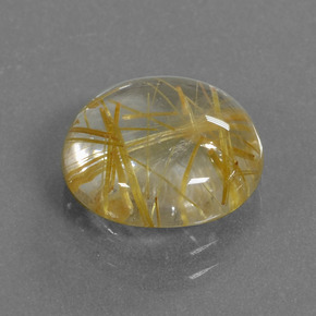
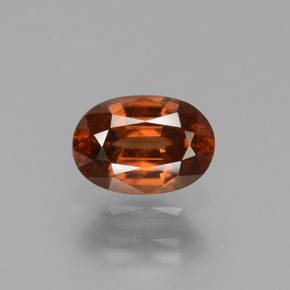
PANTONE 14-1315 Hazelnut
"Rounding out the spring 2017 colors is Hazelnut, a key neutral for spring. This shade brings to mind a natural earthiness. Unpretentious and with an inherent warmth, Hazelnut is a transitional color that effortlessly connects the seasons."
Rutilated Quartz
This Rutile Quartz originates from India. Rutilated quartz is clear or smoky quartz with inclusions of rutile crystals. Rutile is the mineral name for natural crystals of titanium dioxide.
For more information on the color palette please visit https://www.pantone.com
For more information on the gemstones shown or to purchase them please visit http://www.gemselect.com