Pantone's Fall 2016 Colors

banner

Pantone's Fall 2016 color campaign is entitled: A Unity of Strength, Confidence and Complexity. Leatrice Eiseman Executive Director of the Pantone Color Institute™ has this to say about the palette:

"The desire for tranquility, strength, and optimism have inspired a Fall 2016 color palette that is led by the Blue family.
Along with anchoring earth tones, exuberant pops of vibrant colors also appear throughout the collections. Transcending gender, these unexpectedly vivacious colors in our Fall 2016 palette act as playful but structured departures from your more typical fall shades.
Blue skies represent constancy as they are always above us. Grays give a feeling of stability, Red tones invite confidence and warmth, while the hot Pinkish Purples and Spicy Mustard Yellows suggest a touch of the exotic."

I am a big fan of this palette. I feel like the colors really embrace the variety of moods that embody the autumn season. Warm plays with cool and muted neutrals contrast against vibrant brights. I was once again inspired to put together a list of gemstones that I think are great representatives of this palette. So get into your cozy sweater, pour yourself a warm drink and enjoy.
(Click for the Spring 2016 Pantone Gemstone List

pantone stones
1

"Earmarking the importance of Blue in the palette, the new blue shade of PANTONE 17­-4028 Riverside undeniably takes precedence in the fall collections. Cool and calming, strong and stable [Riverside] displays a subtle vibrancy and sophistication. The color borders on exciting, yet maintains a sense of constancy"

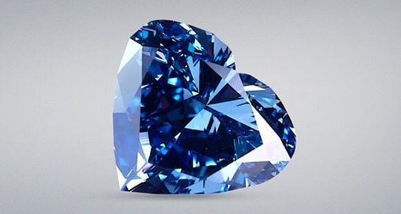
When I saw this color I immediately thought of a bright sapphire that borders on cornflower blue.  For a slightly less expensive option I went with a nice denim colored Lapis Lazuli. 


"Pantone 14-4122 Airy Blue’s lofty nature evokes feelings of lightness and freedom. Designers seeking weightlessness in a world heavy with conflict." 

This beautiful soft color immediately called to mind blue topaz, however I also thought of a much less well known stone; Blue Larimar. Larimar is a trade name for the blue, gem-quality variety of a mineral called pectolite. Pectolite commonly occurs in gray tones and is not especially rare occurring in many locations around the world.
Blue Larimar is found only in one location in the entire world - the Dominican Republic. Blue Larimar is a hydrated sodium calcium silicate with manganese. Its blue color is due to calcium being replaced by copper impurities. Larimar is also often mixed with other materials such as calcite and hematite. Its color can vary from white to light-blue, and from medium sky to volcanic gray blue.


sharkskin

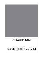
"There’s an edge to PANTONE 17-3914 Sharkskin, and yet it manages to remain neutral. [The color is] pair-able with almost any fall color, bright or muted [as it is a] color that the rest of the palette can rest on" 

If you read my article on Fall stones last year (read it here) you'll know that I am a huge fan of gray tones for fall. It's a moody color that can be either warm or cool. It can be worn on it's own as well as being a perfect neutral that plays well with virtually every other color. 

I wanted to give this fantastic neutral it's due so I have chosen three very different stones. The first is agate with swirling grays, creams, and charcoals. The second is cultured South Sea silver/grey pearl. The metallic look can add a bit of drama, and pearls come in many different sizes and qualities. The third option is a bit different. I chose a grey tourmaline because it has a beautiful watery look that can easily be used in either a dressed up or everyday jewelry piece. 


red

"In contrast to the stable backbone of the Fall 2016 palette, PANTONE 18-1550 Aurora Red adds a welcome punch. A bold Red that is warm, sensual and immediately pleasing to the eye [and] gets the metaphorical blood of the palette pumping. [The color is] exciting and dynamic, [and] breeds unmistakable confidence."

This red color really punches up the fall palette and made me think of maple tree leaves bursting into flames of color. Again I chose three gemstones that I think will add a little pizzazz.

The first is a red toned fire opal. This non-phenomenal version of opal often gives the appearance of having an internal glow, like the embers of a fire on a cold night. Red spinel has been gaining more attention in the recent years. In June of this year the stone was in the headlines when it was decided that it was to be August 's newest birthstone.  My third choice is Red Pyrope Garnet,  basically I see this stone as a slightly less expensive version of spinel. It has much of the same character and can be just as vibrant, but with less of a dent put in the pocketbook. 


taupe

"PANTONE 16-1318 Warm Taupe is a hearty, pleasing and approachable neutral that pairs well with each of the top 10 shades of the Fall 2016 season. [Warm Taupe] suggests reassurance and stability. [It is a color that is] trusted, organic and grounded]."

Taupe is one of those timeless colors. It will warm up a cool fall day. The first stone that I chose has a slightly more golden undertone. Moonstone is a soft looking stone that pairs well with cozy looks. Smoky quartz has a lovely warm tea like color, and with a relatively low price point you can easily go big with this gemstone. The slightly more unusual choice is fossilized coral. The lovely pattern is intriguing and adds interest without needing a lot of embellishment.


cedar

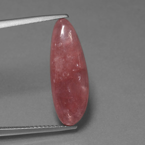
"Like Airy Blue, PANTONE 18-1630 Dusty Cedar gives a nod to the PANTONE Color of the Year 2016, Rose Quartz.
[Dusty Cedar is] a fall and winter version of the Pinks we’re used to seeing in spring. [It is a] dustier rose-toned Pink shade with some complexity [that] exudes warmth and welcome."

This dusty rose has a wonderfully old fashioned feel to is. I chose stones that maybe aren't as well known in the jewelry world. The first is a stone with a little bit of interesting controversy surrounding it. 

Andesine-Labradorite/Red Feldspar: "Andesine-labradorite" came onto the gem scene in 2003, so it is a relative newcomer. It is typically a reddish orange color, along with traces of green and yellow with a faint metallic luster known as labradorescence. The problem with andesine-labradorite is that it was originally sold without disclosing it's true origins and that it was color enhanced. The gemstone was presented as being from South America's Andes Mountains (hence the name 'andesine'). Later it was discovered that it was not actually a new mineral called 'andesine', but actually color-enhanced 'labradorite'. The name 'andesine' was very misleading. In an attempt to correct the problem, 'andesine' was later hyphenated to 'andesine-labradorite'. The trade name is widely used, but it is also referred to as just 'andesine', 'red labradorite', 'Congo sunstone', and 'red feldspar'.

The second stone that I chose is not controversial, but it is also a relative newcomer. Rhodochrosite was first described in 1813, but wasn't introduced to the market until around 1940. It was named the state mineral of Colorado in 2002. Rhodochrostie is a softer stone and you will usually see it carved, made into beads, or cut into a cabochon.


green

"PANTONE 18-5845 Lush Meadow brings to mind fresh botanicals and foliage. [It is evocative of] rich and elegant, vibrant and sophisticated. This shade displays a brightness, panache and depth of color that elevates it from more natural greens [adding even more] elegance woven through this season’s collections."

My immediate thought when I saw this color was malachite. It's rich green tones are perfectly lush and full of life. Malachite is frequently cut into large stones and beads so don't be afraid to go big with a statement piece! The second stone that I chose is a classic green tourmaline. It is a stone that is easy to find and even a small tourmaline will create a pleasing pop of color. The reason that I chose tourmaline over emerald is essentially for the reason that is a more affordable stone in this color, though if price is no concern then emerald would also be a lovely representative!


mustard

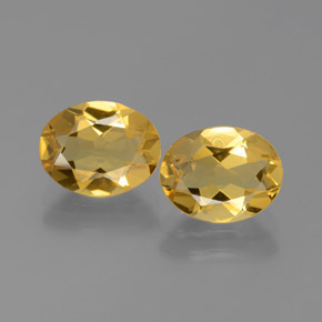
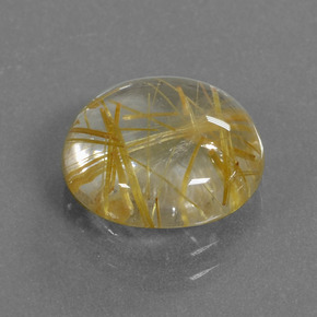
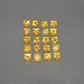
"PANTONE 14-0952 Spicy Mustard is an exotic addition that bounces elegantly off other colors in the palette. [It] adds another splash of uplifting vibrancy; a spicier, zestier Yellow than previous seasons"

I am absolutely envious of anyone that can wear mustard colored clothing (a color that looks awful on me)! On the bright side you don't have to be able to wear mustard well to indulge in these spice inspired gemstones!  I've gone with an inviting golden beryl as my first choice. Second up is the more unusual rutilated quartz which contains beautiful (often golden) rutile needles. Rutilated quartz is one of the few gemstones desirable because of its inclusions! My third choice is a vibrant sapphire. The yellow-orange color will really stand out on a gray day. 


potters

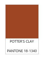
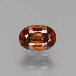
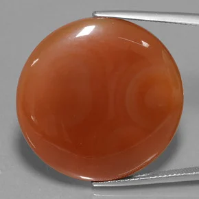
"PANTONE 18-1340 Potter’s Clay has an added degree of sophistication and layering. [It possesses] elements of russet. Orange in its undertones, gives a grounded feeling that’s anything but flat. [It is a] neutral earth tone; expected for fall and winter palette [possessing] real substance; a strong foundation."

One of my favorite gemstones leads the charge in this color. Hessonite garnet is a wonderful choice to bring in the warm tone for fall. In fact this member of the grossularite garnet group has earned it the nickname cinnamon stone. Hessonite also has one of my favorite observable internal characteristics. When viewed under magnification the stone exhibits a "scotch-in-water" or "heat wave" effect cause by tiny included crystals crowded together to create a swirling effect. For those of you that are in the go big or go home category I would suggest carnelian agate. The stone still has the warm cinnamon tone but with less cost and larger sizes.  


10.jpg

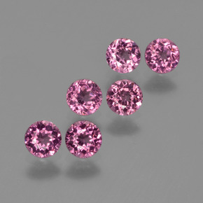
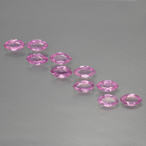
"PANTONE 17-3240 Bodacious speaks to the gender fluidity we continue to see. [Bodacious] lends itself to vibrant color combinations [that are] unexpected in fall. [The color is] versatile; can be used with Pinks and Reds. [The] bright, rich Purple, with hints of a more sophisticated Pink."

This bright fun color can bring a smile to your face and a bounce to your step! The first gemstone I chose is rhodolite garnet.  Rhodolite is a mix of pyrope and almandine garnet. It gets its name from the Greek word, "rhodon", meaning "rose colored". The second stone that I chose is cheerful bright pink sapphire. This flirty color will get you through the gloomy days for sure!

For more information on Pantone's Fall 2016 Palette please visit their website. Stone images courtesy of GemSelect

Happy Birthday Tiffany & Co.

tiffanylogo

On this day in 1837, Tiffany and Co. was founded by Charles Lewis Tiffany. In honor of this American jewelry icon I thought we would celebrate with a few beautiful pieces that are part of the MET museum's (Metropolitan Museum of Art) collection in New York. 

Tiffany & Co. (1837–present) ca. 1890. Made in New York, New York, United States. Gold, diamond, and enamel. Photo courtesy of the MET Museum.

"Related to the extraordinary enameled orchids displayed by Tiffany & Company at the 1889 Exposition Universelle in Paris, this flower pin with a textured gold stem and diamond-set leaves is enhanced by a single diamond dewdrop set amid the realistically rendered purple enamel petals. The gentle arc of its stem and the naturalistic blossom reflect the Art Nouveau style, which inspired jewelers toward the end of the century. The enameled orchids were designed by Paulding Farnham (1859–1927) and were exhibited at Tiffany's New York showroom prior to their departure for Paris. The New York Sun reported on March 17, 1889, that the jewels attracted more attention "than any flower show, display of orchids, or any other of nature's beauty ever brought together in this city."

Louis Comfort Tiffany (American, New York 1848–1933 New York). ca. 1904. Gold, silver, platinum, black opals, boulder opals, demantoid garnets, rubies, enamel. Photo courtesy of the MET Museum.


"After Charles Lewis Tiffany, founder of Tiffany & Company, died in 1902, his son Louis Tiffany was able to pursue artistic jewelry without reticence. He began working on this pursuit in 1902 to prepare himself for the St. Louis fair of 1904, where he exhibited twenty-seven pieces of jewelry. Tiffany Furnaces initially produced the jewelry, but after 1907 Tiffany & Company acquired Louis's artistic jewelry department. This hair ornament is one of the most extraordinary pieces of Tiffany's surviving jewelry, incorporating a remarkably realistic rendering of two dragonflies resting on two dandelion seedballs. Tiffany designed the hair ornament for Louisine W. Havemeyer, who, with her husband Henry Osborne Havemeyer were among Tiffany's most enlightened and devoted patrons. The hair ornament was known only from archival photographs in the collection of the Tiffany & Company Archives until Louisine's great-granddaughter brought it to the Museum's attention. The piece epitomizes his earliest jewelry designs, which were based directly on modest forms in nature, such as field flowers and wild fruit, as well as his affinity for enameling and semiprecious stones with unusual colors. The dragonflies rest on dandelion seedballs, one of which is shown partially blown away, underscoring the fragility of nature. Highly skilled artisans conveyed the transparency of the insects' wings through delicate metalwork filigree. The temporal quality is revealed in the subject: dragonflies rest in one place for mere seconds before flitting away; dandelions disperse into thousands of airborne seeds with the gentlest of breezes."

Louis Comfort Tiffany (American, New York 1848–1933 New York)
Date: ca. 1904. Opals, gold, enamel. Photo Courtesy of the MET Museum.

"This necklace, composed of grape clusters and leaves, is one of the earliest known examples of jewelry designed by Louis Comfort Tiffany. Tiny black opals represent the clusters of fruit, and finely executed enameling in shades of green on gold forms the delicate leaves. Opals appealed to Tiffany for their fiery glow, reminiscent of his vases in Favrile glass. The asymmetry of the design and its organic shapes are entirely in keeping with his passion for natural forms. This necklace was among the twenty-seven pieces that Tiffany made for the Louisiana Purchase Exposition in Saint Louis in 1904. It has been altered twice since its original conception, first by the addition of grape clusters on either side of the central pendant and later by the addition of a double bar-link chain. These changes were probably overseen by Tiffany himself, who is believed to have presented the necklace to his nurse and later companion, Sarah E. Hanley."

The MET Museum

Pantone's Spring 2016 Colors

panquote

After a long and dismal winter it is exciting to see signs of Spring and one of those signs is the return of color. 
In their release statement Panatone says that their Spring color palatte, "Spring 2016: A Transporting and Transformative Canvas", contains  colors that "transcend cultural and gender norms. Vivid brights give way to excitement and optimism, though quiet stability prevails in this season’s palette. For Spring 2016 there are truly no perceivable distinctions in color choices between the men’s and women’s collections, both of which focus on a desire to breathe and reflect, then play."  

When I see color my mind immediately turns to gemstones (hazard of the job), so today I wanted to interpret the amazing mix of uncommon neutrals and vivid brights into gemstones. Some are obvious and some are not so. I had fun playing with color and I hope you do too!

ROSE QUARTZ: "Rose Quartz, a persuasive yet gentle tone that conveys compassion and a sense of composure. Like a serene sunset, flushed cheek or budding flower, Rose Quartz reminds us to reflect on our surroundings during the busy but lighthearted spring and summer months."
For this color the most obvious choice was the best choice. Rose or pink quartz is just what the name says, a pink variety of quartz. The muted pinks are a perfect way to usher in Spring. 

rosequartzpantone

PEACH ECHO and MALAY GARNET: "The fashion and design communities, and consequently, consumers, have been in love with orange for several seasons. Coming to the fore this Spring is, Peach Echo, a shade that emanates friendlier qualities, evoking warmth and accessibility. It is an all-encompassing, tempered companion in the playful orange family."
Malaya (malaia) garnet is one of the rarer and more interesting 'hybrid' varieties of garnet. It is primarily a mix of pyrope and spessartine, which was first discovered in the 1960s. The term "malaya" was derived from a Swahili word meaning 'outcast'. Miners gave it this name because when it was first discovered, local dealers wouldn't buy it, simply because it didn't fall into any of the standard garnet categories and it was cast aside! This is an absolute shame because the pinkish-orange colors of the stone are simply stunning. 

peachecho

SERENITY and SAPPHIRE: "Weightless and airy, like the expanse of the blue sky above us, Serenity comforts with a calming effect, bringing a feeling of respite even in turbulent times. A transcendent blue, Serenity provides us with a naturally connected sense of space."
Considered one of "the big 4" in the gemstone world, sapphires are available in every color of the rainbow excluding red (red is ruby). The perfect compliment to Serenity is a cornflower blue sapphire. It exudes calm but also provides a nice pop of color. 

SNORKEL and LAPIS LAZULI: "A maritime-inspired blue, Snorkel Blue plays in the navy family, but with a happier, more energetic context. The name alone implies a relaxing vacation and encourages escape. It is striking yet still, with lots of activity bursting from its undertones."
Lapis Lazuli (often called just 'lapis'), has been used as a gemstone for thousands of years. It has been mined from Afghanistan since the early 7th millennium BC. It was discovered in ancient burial sites throughout the Caucasus, the Mehrgarh and even as far as the Republic of Mauritania. The funeral mask for the ancient Egyptian pharaoh 'King Tut' was also decorated with lapis lazuli! 

snorkel

BUTTERCUP and LEMON QUARTZ: "With Buttercup designers reveal a shining beacon transporting its wearer to a happier, sunnier place."
Quartz is once again a great choice to bring the bright yellow color into your wardrobe, and because it is slightly less expensive it is a great way to bring large statement pieces in without breaking the bank. 

LIMPET and ZIRCON: "A shade of aqua that leans toward the green family, Limpet Shell is clear, clean and defined. Suggestive of clarity and freshness, its crisp and modern influences evoke a deliberate, mindful tranquility."
Zircon occurs in a wide range of colors, but the beautiful aqua blue is a perfect match! To read more about this amazing stone click here.

limpet

LILAC GRAY and SPINEL: "As in most any season, the need for neutrals arises. Essentially a basic, the subtlety of the lilac undertone in, Lilac Gray, adds a distinctive edge to this classic gray shade."
Gray can easily be kind of a downer color if you let it, but grey tones gemstones are anything but boring. Spinel is a hard vitreous magnesium aluminium oxide that has been used as a gemstone for centuries. The beauty of spinel has even caused it to be mistaken for ruby and sapphire in the past. The lilac color is a beautiful way to accent this interesting neutral from Pantone. 

FIESTA and SPESSARTINE GARNET: "The high energy Fiesta is a harbinger of excitement, encouraging free-spirited exploration to unknown but welcoming locales. A strong and fiery, yellow-based red, the vivid Fiesta provides a stark contrast to the calming, softer nature of this season’s palette."
Spessartine garnet in a redish hue provides the perfect punch to match this vivid color from Pantone. The name "spessartine" comes from the Bavarian word, "Spessartine", meaning "forest", which is a mountain range in Germany where spessartine garnet deposits were found in the 1880s. Spessartine was not often seen in jewelry until deposits were discovered and mined Namibia and Mozambique in the 1990s.

ICED COFFEE and SMOKY QUARTZ: "A transitional color that will take us through the seasons, Iced Coffee manifests as another strong neutral for the season. With its natural earthy quality, the softness and subtlety of Iced Coffee creates a stable foundation when combined with the rest of this season’s palette."
There are a surprisingly large number of "brown" gemstones (I happen to be a huge fan of brown stones). I chose Smoky Quartz because I wanted to (again) choose something that is relatively less expensive because having the option to create large statement pieces is always nice. 

GREEN FLASH and TSAVORITE GARNET: "Green Flash calls on its wearer to explore, push the envelope and escape the mundane, radiating an openness that combines with the rest of the palette in unexpected but serendipitous ways. The popularity of this brilliant hue is representative of nature’s persistent influence even in urban environments, a trend continuing to inspire designers."
Tsavorite is one of the most impressive members of the Garnet family. Tsavorite/lite was named in honour of the Tsavo National Park and the Tsavo River which flows through it. The name was proposed by the former president of Tiffany & Co., Henry Platt, who had followed the developments of the gemstone from the very beginning. A beautiful and lush color for Spring!